Red Paint
Colour by Family
From deepest garnet to soft rose, the variety within the red colour family always surprises. Whether you browse colour online or get expert advice in-store, let us help you find the best red paint colours for any project.
Red is all about range; it can swing warmer towards sunbaked brick and cooler towards crimson-kissed violets. Happily, there is a red for everyone, especially when paired with colours that effortlessly anchor this dynamic hue.Warm + Cool + Most Popular Paint Colours
Here are some of our most popular shades of red including
Caliente AF-290, the Benjamin Moore Colour of the Year 2018.
Get inspired by the power of red paint!
Discover the Language of Red
Red paint colour signifies many things: Strength. Drama. Happiness. Confidence.Explore the language of red in this video and consider how this powerful colour can positively impact your home.

The Breadth and Depth of Red Paint
When considering red for your home interior, remember: you can opt out of its wow-factor. The range of red is wide, from burgundy to maroon to terracotta, empowering you to find a hue that suits your personal style and home aesthetic.Many red paint colours can evoke an easygoing, inviting vibe. Muted red earth tones blend beautifully with brown, taupe and wood. In thoughtful amounts, brick, mahogany and other rustic reds can have the appearance of a neutral surface against colours ranging from dramatic deeps to striking whites and off-whites. Warm, soft reds like Audubon Russet HC-51, Boston Brick 2092-30 and Georgian Brick HC-50 offer alternatives to the “very cherry” side of red.

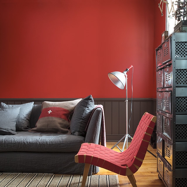
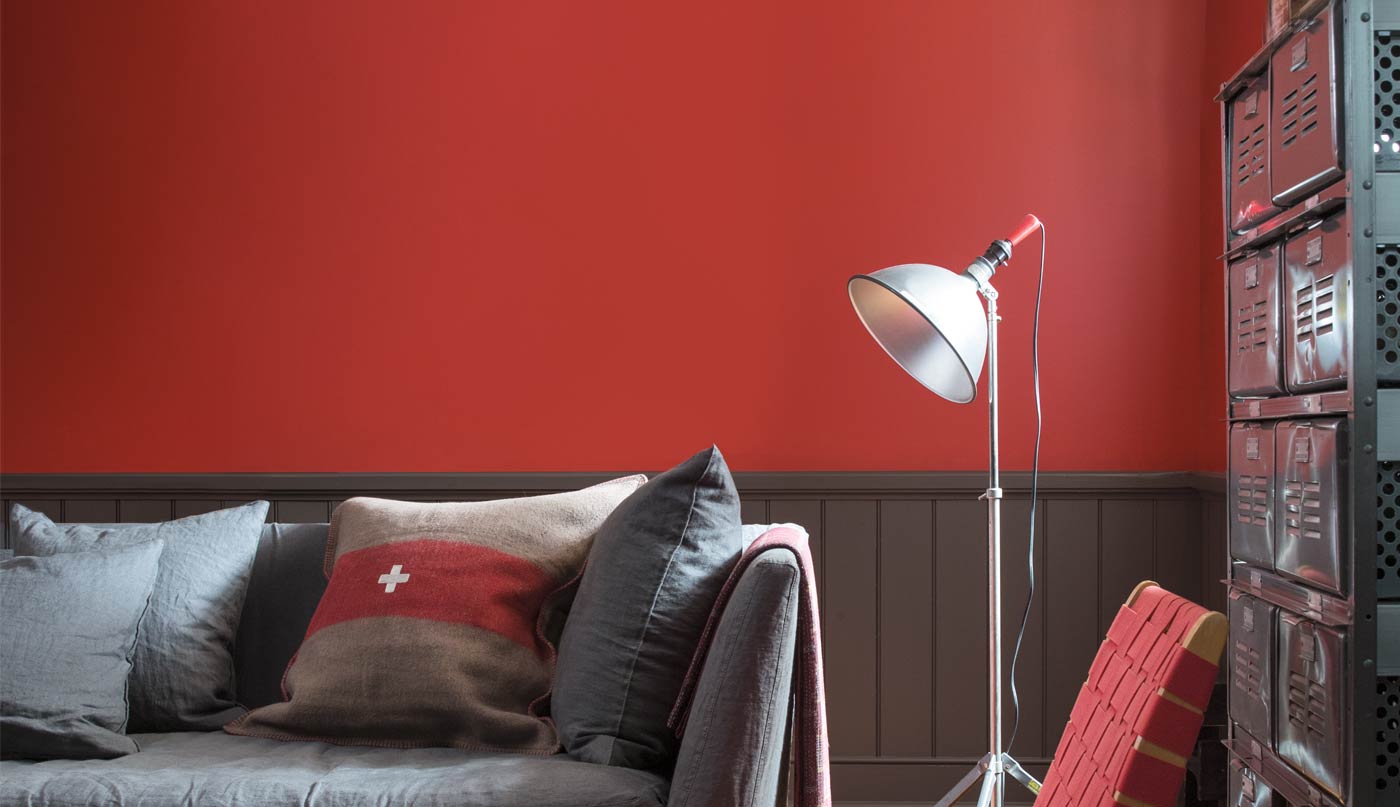
Red Pairs Well
There are a wide range of colours that pair beautifully with red paint. This bedroom’s Bricktone Red 2005-30 is a pinkish, dusty red that blends easily with a range of patterns, textures and colours to create a livable space with an interesting, engaging design and palette. Try on different colours and patterns against your choice of red–you’ll likely be pleasantly surprised!Other colours that work well with almost every red include warm neutrals such as Coastal Path AF-380 and Bradstreet Beige HC-48, and cooler neutrals including Revere Pewter HC-172 and Wish AF-680.

Perk Up Smaller Spaces with Red
Use the power of red to give smaller spaces in your home extra attention. Here, a red-orange accent wall in Raspberry Blush 2008-30, the Colour of the Year 2023, elevates the small kitchen with a vivacious pop of colour. Consider red hues for a striking entryway, a punchy powder room, or as a backdrop for inset shelving.A deep red paint in a higher gloss heightens the drama – sending a signal of colour confidence. Deep reds we love include Dinner Party AF-300 and violet-tinged reds like Raisin Torte 2083-10 and New London Burgundy HC-61. An area rug, red-flecked window treatments or pillows are great places to experiment with red, easily sparking up any space.

Playing with the Power of Red
One of the best aspects of paint is the ability to transform a space in a relatively short period of time.With red, the high impact of painting is easily magnified. This red bedroom is a great example of a space that takes on a crisp new personality with the use of Caliente AF-290 and clean Opulence OC-69. The dark gray door and calming blue accents create a perfect colour balance for the bold red and white colour combination in the room.

A Touch of Red on Exteriors
Even in small doses, red is a great statement colour–and making a statement when it comes to your home’s exterior is always a good idea!When considering a red hue for exteriors, front doors have become a go-to for homeowners and a favourite exterior space perfect for showcasing deep colours against typically neutral hues. On this exterior porch, King's Red CW-335 is framed by siding painted Amber Slate CW-685. The result is subtle yet playful, a touch of creativity on a traditional exterior.
As always, let the architecture of the space be your guide, and use colour to express your personal style.

Buy a Paint Sample
Test your paint colours from morning to evening, under both natural and artificial lighting conditions.
Ideas & Inspiration
Spark your creativity with a range of design and colour ideas for your home.

Ready to Explore?
Browse photos and gain expertise to create remarkable interiors and exteriors.