The Colours of the French Quarter
Explore the architecture of New Orleans through the lens of colour.
The Colours of the French Quarter
Explore the architecture of New Orleans through the lens of colour.
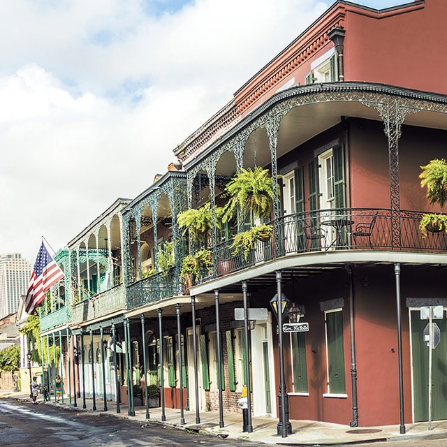
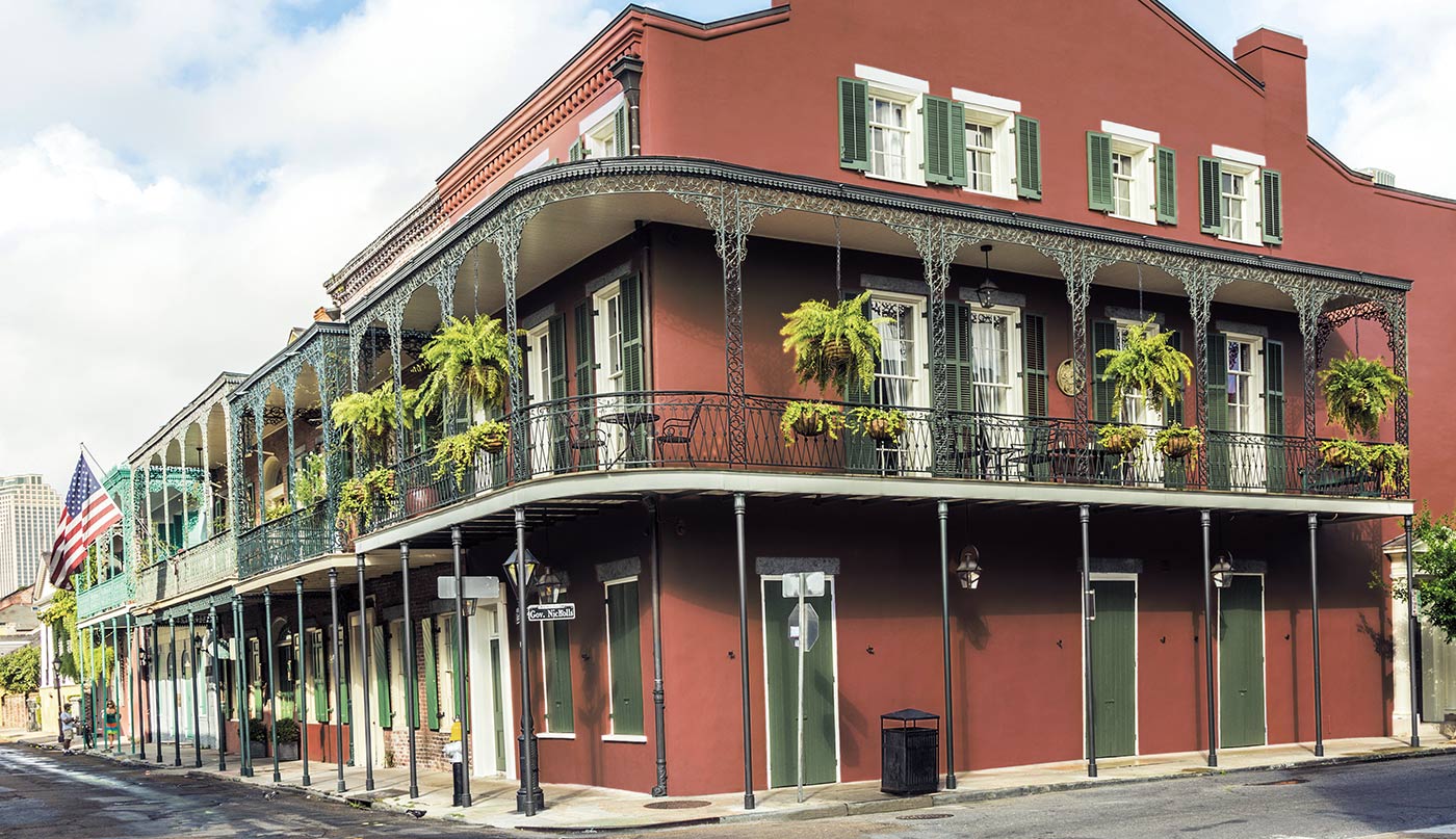
Synonymous with a zest for life, New Orleans’ French Quarter is truly incomparable. From cobblestone courtyards tucked away from the street to wrought-iron balconies that set the stage for drama, the architectural details and colours of the French Quarter offer an eclectic, inspiring mix.
Our experts curated four paint colour palettes to echo a century’s worth of French Quarter colour trends. In doing so, we’ve captured the spirit and soul of the French Quarter—and a cornucopia of the most beautiful colours of New Orleans.Use these colour schemes—from moody deeps to muted pales to richly saturated hues—to spark creativity and self-expression.
1820 – 1840: Earth Tones and Cottages

An amalgamation of French, French-Canadian and Spanish influences and architecture, Creole-style cottages were extremely popular during this time period. Prominent colours included earthy hues—think brick, warm stone and terracotta. These colours mirrored the building materials of the time.
The warm vibe of this golden bedroom adds a flaxen touch with Dorset Gold HC-8 on the wall and Bryant Gold HC-7 on trim. These colours and many more are part of the Benjamin Moore Historical Collection, a selection of paint colours that honors 200+ years of American style.
The warm vibe of this golden bedroom adds a flaxen touch with Dorset Gold HC-8 on the wall and Bryant Gold HC-7 on trim. These colours and many more are part of the Benjamin Moore Historical Collection, a selection of paint colours that honors 200+ years of American style.
1840 - 1870: Pinks, Grays and Greek Revival

Narrow, rectangular buildings known as “shotgun” houses, as well as townhouses, joined cottages in popularity during this time. Greek revival architectural styles exploded, with Italianate style right behind it. Intricate cast iron, rhythmic arches, and bracketed eaves characterize the look.
During this time, there was a shift in colour. Soft blushes like Pale Berry 2103-60 and breezy pinks like Marry Me 1289, seen in this al fresco corridor, became increasingly popular. Muted burgundies like Garrison Red HC-66 added deeper tones to the mix.
Colours that mimic stone were ever present. Today, timeless grays and neutrals remain popular, like soft greige Revere Pewter HC-172, and Cement Gray 2112-60, seen in the window grating of this al fresco corridor.
1870 - 1890: Blues, Neutrals and Architectural Details

Towards the end of the 19th century, architectural details became more affordable and in turn, more broadly available. From a colour perspective, we see more variety and depth during this period.
The Eastlake style, synonymous with intricate woodwork crafted with new techniques and machinery, became popular. Gingerbread trim, brackets, and ornate embellishments opened the door for colourful accents.
Exterior accent colours became more of a focus, a sign of new tastes and means of expression. Siding was often painted in warm, earthy colours like Avon Green HC-126, Hodley Red HC-65, and Quincy Tan HC-25 from our 1870-1890 French Quarter colour palette. Green paint colours were also popular in French Quarter exteriors—and remain so, as seen on the front door within this charming modern-day courtyard.
1890 - 1920: Soft Pales, Arts & Crafts, and Prairie Design Influences

This period embraces an eclectic mix of styles and cultures that reflect the global blending of the French Quarter district, as well as design influences from parts of the U.S. beyond Louisiana.
Taking points of inspiration from California, the Arts and Crafts style grew in popularity, helmed by Britain’s key contributor, William Morris. Craftsman prairie styles of the Midwest also became influential.
Interior paint colours became lighter, shifting away from the heavier hues typical of Victorian colour combinations. This less weighty, more modern approach was seen in a range of airy pale blues, pinks, and soft, light neutrals. You can replicate the vibe with Tea Light 471, Palladian Blue HC-144, and Heavenly Blue 709, shown in this relaxing bedroom.
Want more southern style? See inspiring interiors and exteriors from our exploration of southeastern colour and design.
Keep Your Colour Journey Going!

Regional Colour Palettes
Get expertly curated regional colour palettes and design inspiration.

Get Exterior Colour Inspiration
Make a statement in your neighbourhood with an inspired exterior.

Buy a Colour Sample
Test your paint colours from morning to evening, under both natural and artificial lighting conditions.