With a passion for construction and architecture, Tracy Morris builds form and functionality into every one of her custom design projects.
HQ: Washington, D.C. Learn more at Tracy Morris Design or @tracymorrisdesign.
Tracy Morris unpacks the differences—and similarities—of residential and commercial projects, and shares her favorite hues for highlighting angles and shadows.
Can you share what the process looks like to build a house from the ground up?
Tracy: We do many ground-up builds, and have the advantage of mapping out the entire house based exactly on what the client wants and needs.
Typically the architect brings me into the project at the design phase. With my background and construction experience the architect knows that I am going to be an excellent bridge with the client. We collaborate on proportion, determining size and room dimensions and selecting finished materials. My design contribution, including deciphering what the client needs and wants, makes for a smoother planning process.
Our goal is to show every space—all the measurements and architectural elements—so the client understands exactly what is being built. We create a client packet, sharing all the materials we want to utilize throughout the home. We walk the client through the house from foyer to exterior grounds. We share every aspect of the house they are building so when plans are complete, they know the floor layout, selected surfaces, lighting, and furnishings, including any heritage pieces they want integrated. They also know the functional aspects, like the width of driveway and walkways, placement of patio or outdoor living space.

Does the exterior architecture, such as windows selection, impact the color you chose for both exterior and interior?
Tracy: Absolutely. If we are building a modern contemporary house, and have steel windows that are black, we will use a color like Ballet White OC-9 for the interior so the contrast really defines the windows. I was fortunate to own a Hugh Newell Jacobsen House in Virginia. These houses are crafted in pod formation so it calls for clean, streamlined elements, and, for me, I used all white—Winter White OC-21—to show off the angles and shadows. I painted the interior that had no moldings or trim the same; Winter White was the perfect hue to highlight shadows throughout the day.
"TO ME, PAINT IS THE BIGGEST BANG FOR ANYONE'S BUCK."
- Tracy Morris,
Owner/Principal, Tracy Morris Design
What colors do you count on for ceilings?
Tracy: If you want to make a space feel large and open, use a warm white, and paint the entire space with it. The space will feel more open and create a nice envelope. If I go with a white ceiling–my preference is Decorator’s White OC-149–I will tone it with a bit of tint from the wall color and it pulls the entire room together. If you have high ceilings and want to pull in some warmth, use Atrium White OC-145, which has a slight pink undertone.
Tracy Morris
Designer Showcase
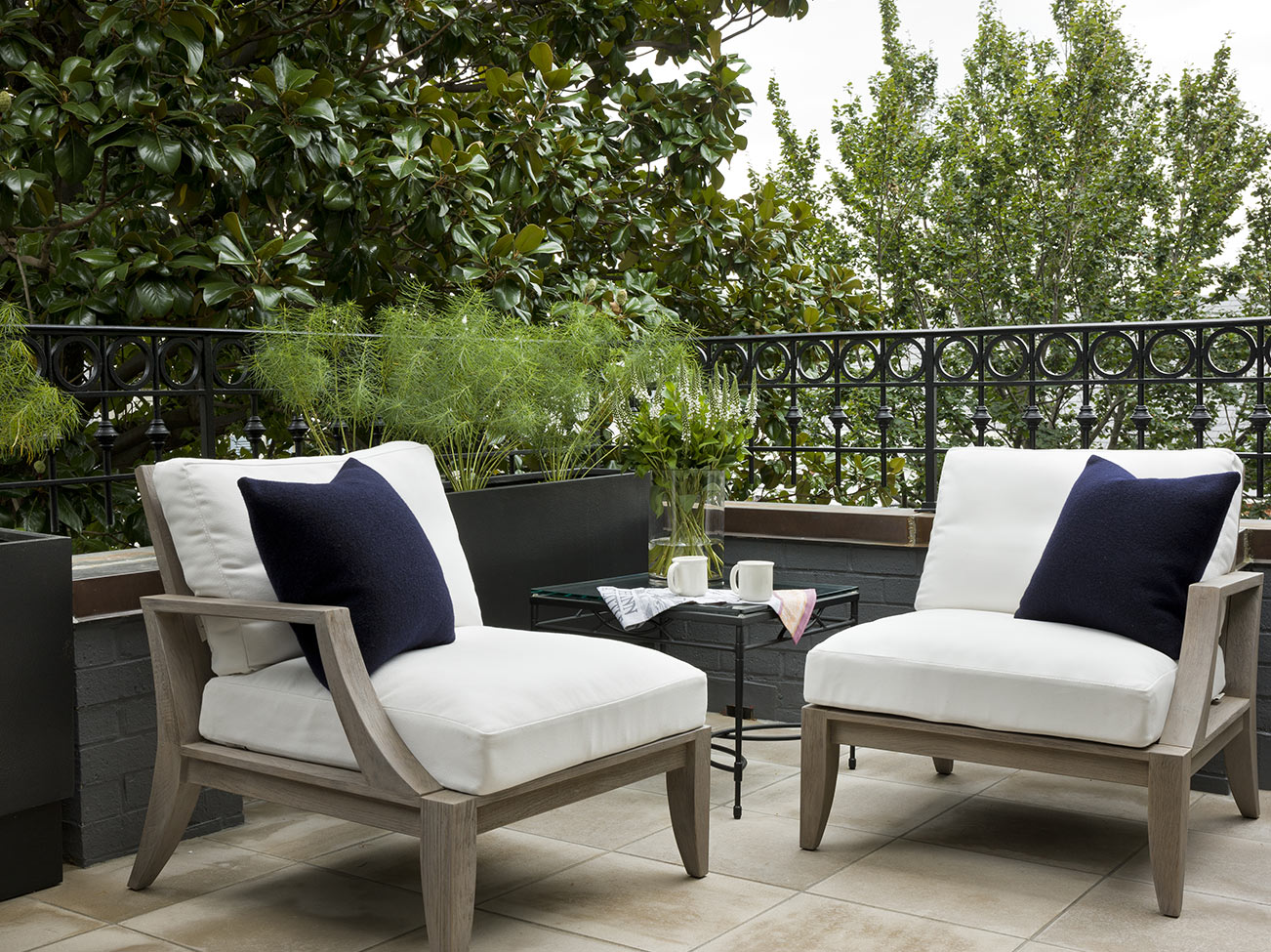
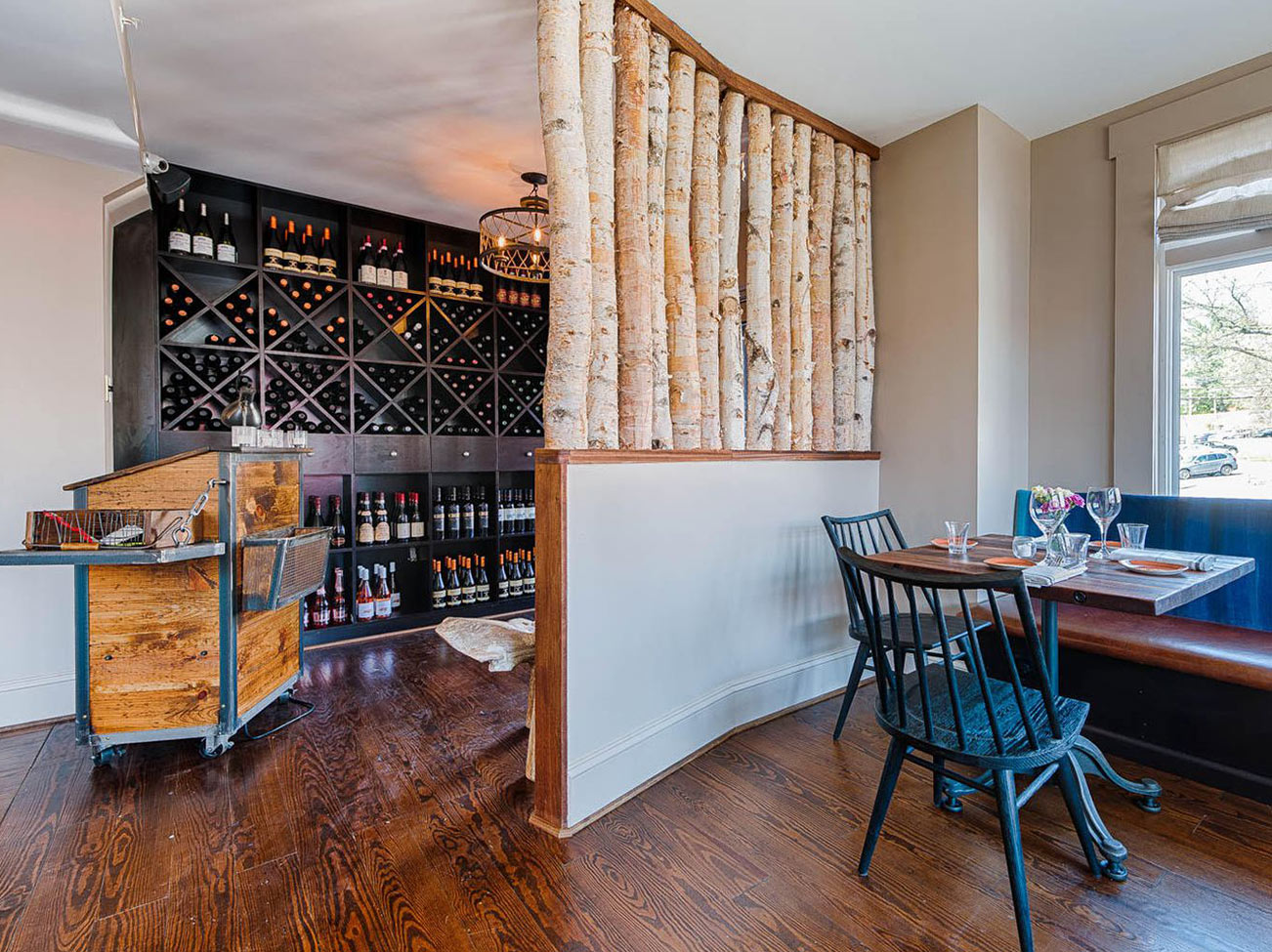
Take a tour of Tracy's interior design work to see her ability to create highly stylish spaces that effortlessly meet the pragmatism of everyday life.
All of the photos in the Design P.O.V. series are courtesy of the interior designers featured. You can find paint colors like the ones pictured at
your local Benjamin Moore retailer.
Do you have a group of go-to colors, like a "signature" palette?
Tracy: I always use Narragansett Green HC-157 or Essex Green HC-188 on front doors. Black does not register well in sunlight, so this little bit of dark green, is my “signature front door color.” And we are also seeing more color being used in both kitchens and baths. Lots of navy and mushroom taupes. So often the connection of what people wear translates to what they want to see on the walls of their homes. We’re also seeing emerald green coming in as an accent. And for fixtures, we are seeing a preference for polished chrome and nickel, along with brushed or aged brass.
What are the major differences between residential design and commercial design?
Tracy: For me the difference between residential and commercial work is the complexity and layers of people. With commercial projects you are usually dealing with a committee or group of investors and various personalities, varying processes and opinions. You have to appeal to not only the people overseeing the project but think how to appeal to the end users of the space as well. It's all about finding a way to please all parties involved while delivering the project on time and on budget.
With residential you really get to know the client on a personal level. They are the ones who are making the decisions and are the end users. We work with clients for anywhere from a few months for smaller projects to a couple years for custom home builds. Through that time, we don't just get to know their style, but their families and how they live. So, whether commercial or residential, it's all about getting to know the people to be able to guide them in the right direction. That's what we do.
Are there any particular industry manufacturers that you trust and rely on?
Tracy: For paint and wall color, Benjamin Moore is my go-to for all my clients’ home. For other aspects of the home we turn to David Sutherland’s Perennials. With Perennials, you have no problem with any spills, stains, “mistakes,” whether on their fabrics or rugs. It's amazing. You just take a little bit of warm water to their products and red wine, lipstick, chocolate, it all comes out. So for families, with kids and pets, or who entertain a lot, we use a lot of their fabrics. We also use a lot of Moore and Giles leather. Their leather is absolutely the highest quality, simply spectacular. I have used them at the Willard Hotel in D.C. and I have used them in my clients’ homes. They provide, without a doubt, the most beautiful saturated colors and stand the test of time.

Why do you choose Benjamin Moore for your work?
Tracy: Years ago when I started the firm, I went to a Vienna paint dealer in Fairfax. And I quickly learned that the colorants, the pigments used, the hues created were all so true with Benjamin Moore. So what I saw in a client’s carpet, in a counter surface, could easily be translated into the appropriate Benjamin Moore paint color. On color selection I always start with the permanent surfaces in the home. So if a client loves an antique rug or they just remodeled their kitchen with a multi colored countertop I go to those items and pull out the appropriate Benjamin Moore color. And I know whatever color I pull from those surfaces, is the exact color I want.
For me, only Benjamin Moore colors are true, accurately created, and offer color that stays constant. They are also durable, and extremely washable. So that is why I only use Benjamin Moore. I need that dependability and I need that trust, particularly as I am putting it in a client’s home.
If you were a color, what would it be?
Tracy: I would be Comet 1628. I love Comet as a color because it's warm and cool combined.
Can you share the three words which define what you need to succeed as a designer?
Tracy: Tenacity, patience and humility. Everyone thinks it is a super glamorous profession. But watch me scrub a client’s kitchen floor after an installation, ten minutes before they arrive home. It takes a lot of hard work and elbow grease to create something beautiful.

Design P.O.V.
See video interviews, get advice, and find inspiration from leaders in interior design.

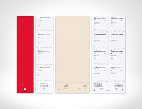
Order Paint Color Sheets
Streamline and simplify paint specification with the help of Benjamin Moore Paint Color Sheets.