Designer Color PalettesDrake/Anderson
Designer Color PalettesDrake/Anderson
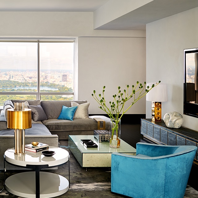
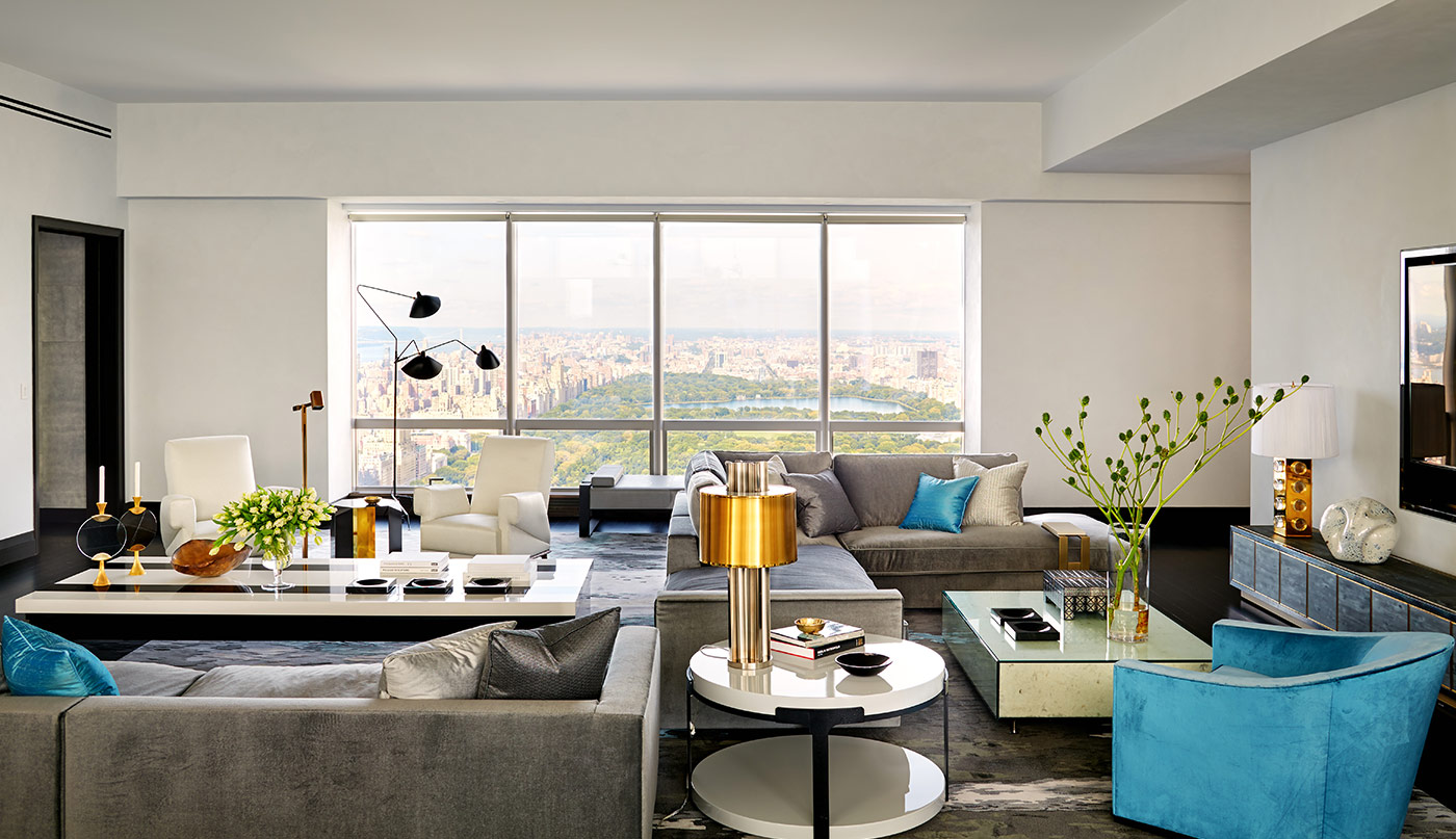
Designers Jamie Drake and Caleb Anderson of Drake/Anderson reflect on location, luxury, and a paint color palette they curated inspired by one of their Manhattan-based design projects. This palette of whites, neutrals and saturated paint colors effortlessly balances high design with everyday living.
Drake/Anderson’s Designer Color Palette is as simple as it is sumptuous.Inspired by the lofty views from this Manhattan apartment the duo designed, Jamie Drake and Caleb Anderson say the palette echoes the need for equilibrium in design. “Vibrant sky blue, urban grays, and black punctuations imply bold luxury, while a mostly white base creates the backdrop for modern living.”
The Drake/Anderson Designer Color Palette
This refined palette of paint colors brings the classic contrast of white and black together with cool blue, earthy ochre, and must-have greige.


Meet the Designers
Enjoy video interviews with all of our Design P.O.V. interior designers.

Inside Design
Explore distinct design topics from the interior designers featured on this page.