Jamie Drake and Caleb Anderson work on a range of luxury residential and commercial projects. Combining the refined with the unexpected, the team creates environments that are timeless, elegant and most importantly, welcoming.
HQ: Irving Place, Manhattan. Learn more at Drake/Anderson and @drake_anderson.
Drake/Anderson Co-Founders Jamie Drake and Caleb Anderson reveal their favorite projects, share the myriad ways clients weigh in on paint color decisions, and encourage homeowners to go beyond "safe."
What project would you identify as a Drake/Anderson unqualified masterpiece?
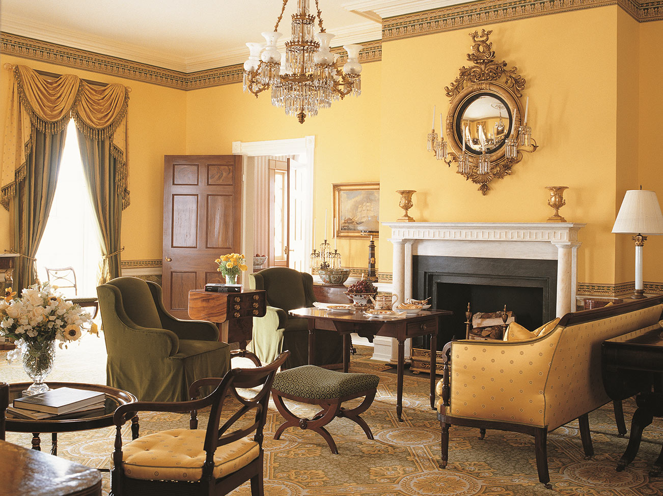
Jamie: The project that really hit all the notes was the restoration and renovation of Gracie Mansion, the official New York City mayoral residence when Michael Bloomberg served. It was this wonderful opportunity to do something which we'd never done before, a historic preservation project. We needed to learn how to be preservationists and all that was involved in that process.
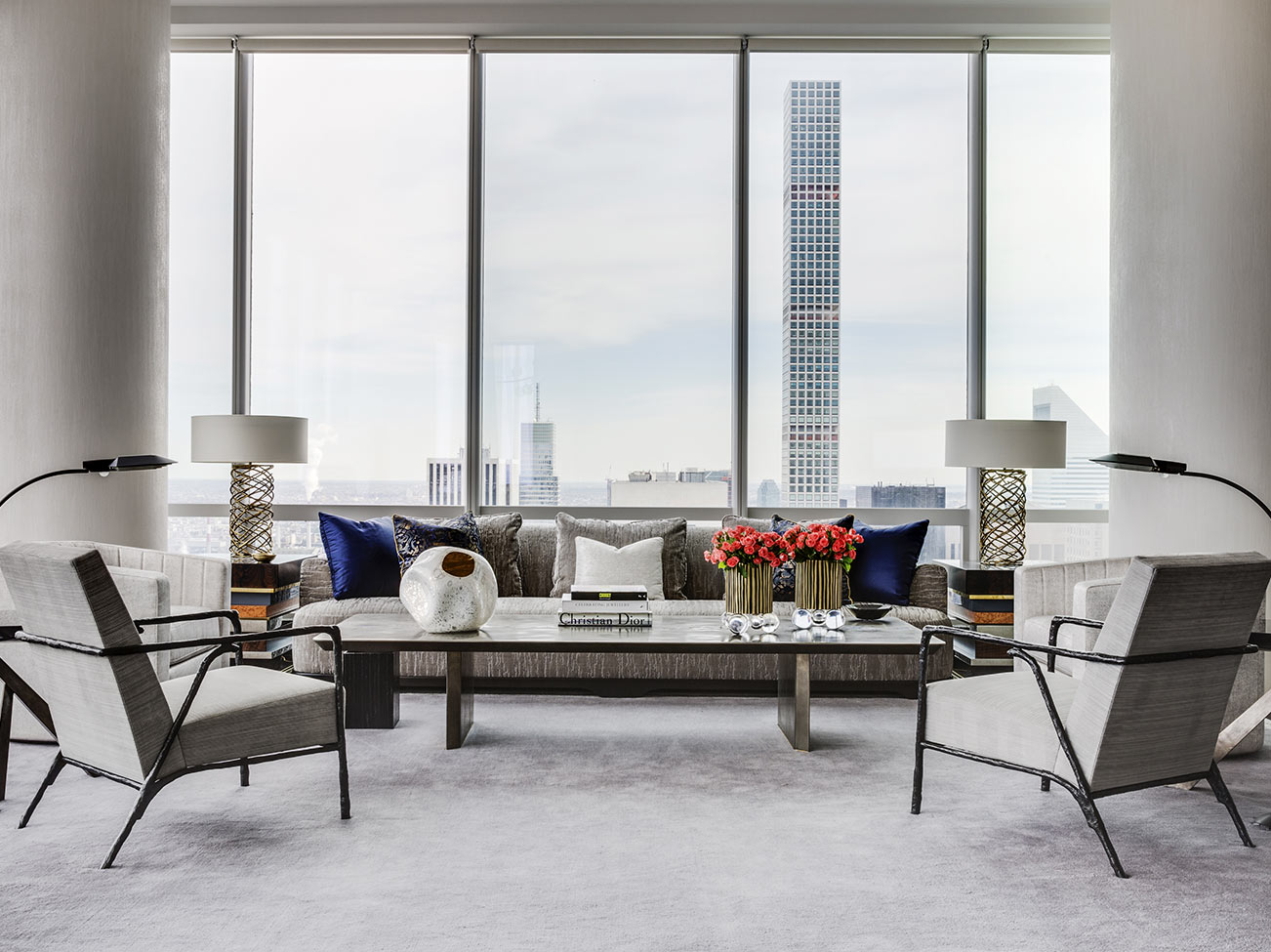
Caleb: A project that is representative of where we are and directionally where we are going, would be the 2018 Kips Bay Decorator's Show House in New York City. Through that room design you were able to see a merging of Jamie and I as being truly in synch, creating something that was new, different and exciting, while benefitting an outstanding cause.

What would be the simplest way to add impact to an interior space?
Caleb: One thing that can change a space is lighting. Giving yourself the flexibility to dim your lights or putting in a better quality bulb can make a huge difference in a space.
Jamie: I honestly do think one of the easiest and quickest ways to impact your space is with paint. What could be a bigger statement than painting the walls differently and surrounding your existing furnishings. And it's one decision instead of dozens, and it's truly impactful.
"IN OUR DESIGN PROCESS, COLOR IS VERY IMPORTANT EARLY ON."
- Caleb Anderson
Co-Founder, Drake/Anderson
Drake/Anderson
Designer Showcase
Get inspired by these stunning interiors, all of which reflect Drake/Anderson's unique brand of dynamic eclecticism.
Designer Showcase
All of the photos in the Design P.O.V. series are courtesy of the interior designers featured. You can find paint colors like the ones pictured at
your local Benjamin Moore retailer.
When you first lay out a project and determine what you want to accomplish, when do you address color?
Caleb: In our design process, color is very important early on. Clients will let us know colors that they like, colors that they don't like. From that, we build materials using swatches, beautiful stone and textiles. We create a conceptual palette that we present to get an initial response and feedback.
Jamie: Liking the palette is such an important part of every project, because it really does define the personality and may be the first thing you notice. It can come at different points in the project. I think that when I start a new project and I'm looking either at a floor plan or the actual space, I immediately go to the layout, to how the room will flow, where the large objects and furnishings will be placed. And I may at the same time be envisioning it in a specific color palette, particularly if it's been defined by a client in advance.
Do many clients leave everything to you, or do they really want to weigh in when it comes to color?
Jamie: I think color is one area that clients very much have a point of view. It's something they understand and hold on to. And I think most clients can define, to a certain extent, at least the colors they don't like. Once you get those off the table, you have a defined place to begin your color palette creation. Usually people can say whether they like pastels vs. jewel tones. Then we run from there.
Caleb: Often what we find with clients is there are multiple color directions that they want to pursue but are unsure of which one for which room or in general.
When I look at color, I typically like some progression and a relationship, even if they are a completely different color or a color that you think would have no connection to the previous room at all. There has to be some type of relationship. It's just like any other material or anything else in the design. I like to understand the connection and consider it as a whole.

With textiles, and paint particularly, how do you work around sheen?
Caleb: Sheen is important of course, but we consider it like we do other materials. We like contrast and we like variation. We don't like everything to be flat. We take advantage of using the various finishes to create interest and dimensions, even if it's the same color. A sheen plays an important role in creating variation.
What would your recommendations be to homeowners who are taking on their home design themselves?
Caleb: I would tell every new homeowner that doesn't plan on hiring an interior designer to measure the elevator, to measure the door openings, to measure the staircase, because you would not believe how many people end up having to cut sofas in half or send things back, because they don't fit through the opening.
Jamie: I would tell a homeowner to be true to themselves, to look in the mirror and not be chicken, not be afraid and do everything really bland because it feels safe. Try different things...and be a little bolder.

Design P.O.V.
See video interviews, get advice, and find inspiration from leaders in interior design.

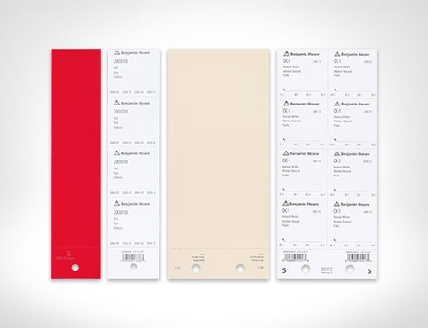
Order Paint Color Sheets
Streamline and simplify paint specification with the help of Benjamin Moore Paint Color Sheets.