Design P.O.V. | Designer Dialogue


Design P.O.V. | Designer Dialogue
Elevate your color and design outlook with insights and inspiration from our expert Design P.O.V. contributors.
Enjoy this round of advice from Benjamin Moore's network of savvy interior designers and apply their tips and insights to your next design project! See more Designer Dialogue Q&As here.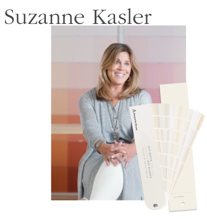
Suzanne Kasler Interiors
Do you have a favorite color for interiors? Exteriors?
I love all Benjamin Moore white paint colors; they have the best range for both interiors and exteriors. I continue to go back to my favorite, White Dove OC-17 for both interiors and exteriors.
What role does light play in color selection?
Light is so much a part of the color decision. For example, a Florida home will have a completely different color palette and hue than a city apartment.
Hear more from Suzanne Kasler.
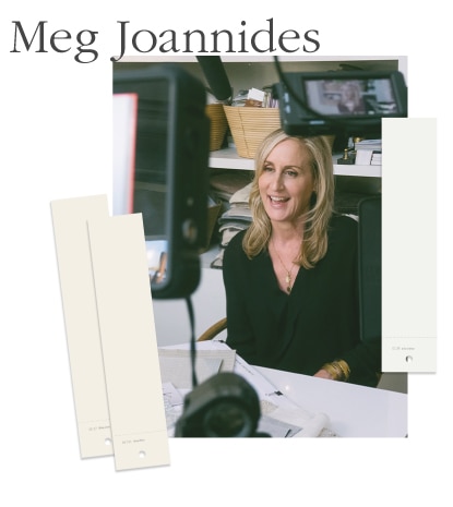
MLK Studio
When designing a home, do you identify a color theme for each room?
A color theme for each room is important, but should be thought of as chapters of a book. Each room should be its own anecdote, but together the rooms must all work in harmony to create one cohesive vision.
What are some of your favorite colors to work with?
Oxford White CC-30 is a nice, fresh white that I tend to use often for trim. I do use a lot of white—other favorites are White Dove OC-17 and China White OC-141.
Hear more from Meg Joannides.
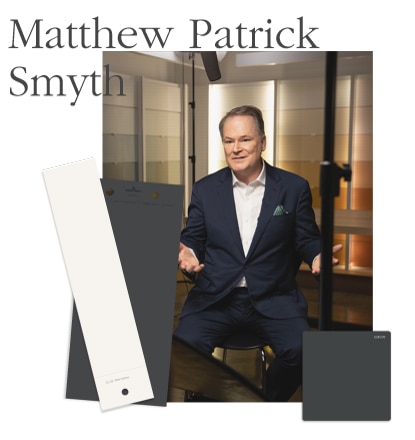
Matthew Patrick Smyth Interior Design
What paint color do you prefer for interiors and exteriors?
Notre Dame CSP-570 is my favorite dark color for interiors. Opulence OC-69 is my favorite new go-to light color. For exteriors I just painted my house in Wrought Iron 2124-10.
How do you work with bolder colors?
Certain spaces lend themselves naturally to bold colors. Natural light, and how the room is used and when, are also factors. Dining rooms, for instance, are traditionally places to turn up the volume. They are primarily used at night, and should be memorable, entertaining, or intimate, all of which can be controlled by the use of color.
Hear more from Matthew Patrick Smyth.
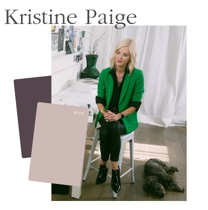
Jackson Paige Interiors
What are some inspiring, new ways you've recently used colors?
We are using bold geometric shapes in some of our paint applications. And in more austere projects, we have been using limewashes and plaster.
What are some of your favorite colors?
White (White OC-151), Navy Blue (Hale Navy HC-154), Dusty Rose (Batik AF-610), Bordeaux (Chambourd AF-645). In general, I like white, gray, and black.
Hear more from Kristine Paige.
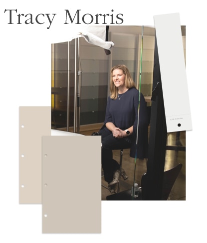
Tracy Morris Design
What are your go-to paint colors?
Edgecomb Gray HC-173 is a versatile color I keep going back to; it works for so many different spaces and styles. For exteriors I love Revere Pewter HC-172, which works great on interiors as well.
Do color trends and forecasts have an impact on your work?
I try to keep to a classic palette and avoid things that will date a space quickly. If clients are looking to incorporate more 'of the moment' colors, I use them in smaller accessories so they can be swapped out easily.
Hear more from Tracy Morris.
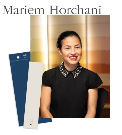
MHM Interiors
What colors rise to the top for your clients?
Right now it's gray, the new neutral. My clients clamor for it. For exteriors, it's still gray, though we have fun with doors. Recently, I painted a client's front door in Downpour Blue 2063-20; it looks fabulously sophisticated, yet full of character!
What do you think about the use of bold or saturated color?
Bold and saturated hues stimulate the brain and emotions and keep your eyes moving around the space. I think of them in the same way that a vibrant artwork is a focal point and draws your eye to it.
Hear more from Mariem Horchani.
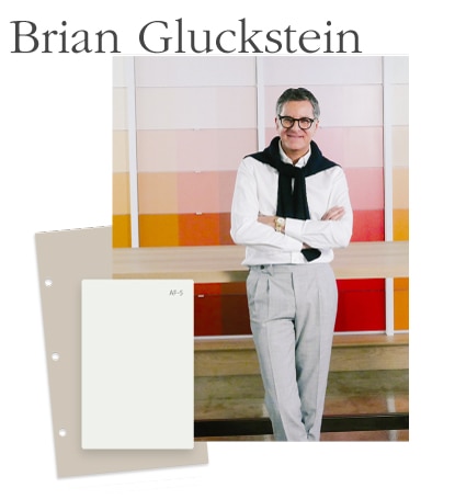
Gluckstein Design
What's new in your color repertoire?
We're using a lot of beautiful saturated paint colors on walls, trim and doors. It adds a nice drama to a space. We're also painting trim to match bold wallcoverings and grass cloths. And I love a door or ceiling that isn't just painted white.
How do you ensure visual cohesion from room to room?
I always build an overall palette for the house and vary the intensity and accents from room to room. I might go lighter in the living room and then more dramatic in a library or dining room and then change up the accents in a bedroom.
Find additional design tips from Brian Gluckstein in Bedroom Style Ideas.
Hear more from Brian Gluckstein.
