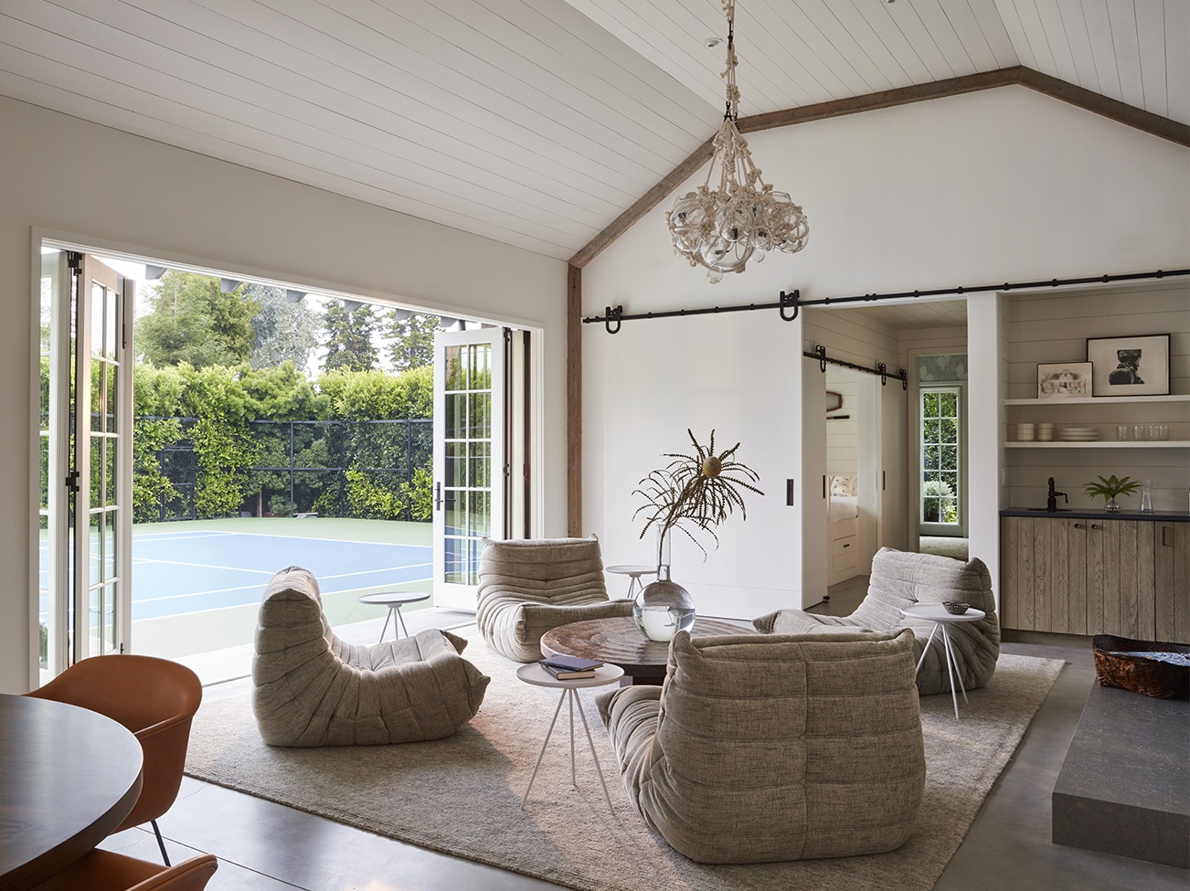
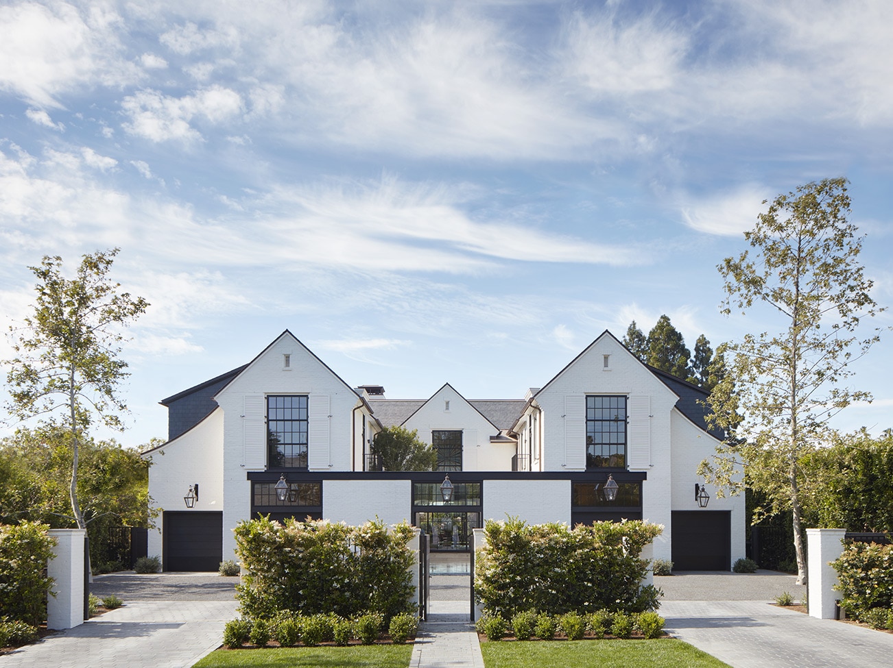
MLK Studio believes that a home is a sanctuary. The firm's "ground up" approach includes a keen focus on scale and proportion and a penchant for modern, elegant style.
HQ: Los Angeles. Learn more at MLK Studio and @MLKStudio.
Meg Joannides, Principal of MLK Studio, shares how she creates layered color palettes for clients (despite neutral being her own "go to"), her commitment to bringing clients fresh ideas, and the places where she finds inspiration.
How do you identify the distinct personality of your client in order to create a custom, personalized design plan?
Meg: Every client comes with a different set of needs. First, we look at the big picture–take in the overall architecture they have chosen, either already built or what they plan to build. Then we dig deeper by spending time with the client. What are their fashion choices–colors, textures, overall look. That tells me a lot. Then, do they collect art, do they have pieces they must keep; all of these things help determine design direction.
Often we have clients who moved to California from a large metropolis– and they still want a little bit of that style in their new home. Sometimes we start with Pinterest boards, pinning lots of things from flowers to furniture, architecture to travel images. We then ask the client–what speaks to you? All of the details help us analyze what colors, or no color, how formal or informal. It also takes in a bit of my version of "mind reading"–after 2 decades we rarely get the style direction wrong.

You've shared that one of your designer "hats" is that of educator–how do you approach that role?
Meg: Frequently you are working with a client who has never undertaken a design project or even if they have, they gravitate to what they are used to, what they know or have seen. They don't realize the breadth of options, design directions, and the number of decisions involved in the process.
Most of the time they're open and say–"if you show it to me, I'll look at it," and then will change their minds and move to a new place. Sometimes it can be a preconceived notion left over even from childhood. We hear, "that reminds me of my grandmother's house." And I have to share that it's a totally different material. It's important to bring our ideas to the table, and not just compromise. We strive for the best results possible while ensuring the client is completely satisfied, and hopefully even beyond.
We live for the end of the project when the client says, "I can't believe you've created this house for me." They're just falling down in love with the house and that's why we do this, it's the reveal at the end of the project that is so rewarding.
"THE COLOR PALETTE IS ALWAYS BASED ON THE CLIENT'S TASTE."
- Meg Joannides
Principal, MLK Studio
Where do you find inspiration?
Meg: Mostly from travel and what I encounter through various explorations–either personally or for business; for example, the Milan Furniture Fair and all its surrounding design venues provides a wealth of inspiration and new directions.
I've lived in Europe, and travel there regularly. As a designer you are constantly taking in impressions, encountering new things, or revisiting old things that resonate anew in a different environment.
When I was working on my rug design for Christopher Farr, the initial concept was from a remote road in Sardinia, the cracks attracted me, and that became a sketch—and now the rug is selling in Christopher's showroom.
MLK Studio
Designer Showcase
See how MLK Studio beautifully blends livability with extravagance in a range of expertly designed rooms.
All of the photos in the Design P.O.V. series are courtesy of the interior designers featured. You can find paint colors like the ones pictured at
your local Benjamin Moore retailer.
What would you say is the number one design rule that everyone should follow, or not?
Meg: The most important aspect in delivering successful interior design is the scale and proportion of the room. We look at the geometry of the space and how all the pieces being considered will fit together so that it is all visually pleasing. It's hard to master, but I love the challenge of making it work. So before color, before furniture and accessories, you go back to the interior architecture and view the shell with the scale and proportion that works within it. Everything has to be right sized–molding, door knobs, window panes. All the elements have to be correct–get that right and then you can put whatever you want inside the envelope.
How do you start pulling together the palette to present to your client?
Meg: To start, color can be a sensitive subject and clients usually tell me upfront what color or colors they can't stand. That eliminates a number from consideration. I then revert back to what is the style of architecture. If we are designing the interior of a very progressive structure, architecturally speaking, there likely won't be color anywhere. Metal panels or mirrored or high gloss walls, stainless or cold rolled steel will provide the visual interest.
Where color is appropriate, you walk the floor plan and ask "what colors work with other colors and how do I layer them?" If a color is in one room, what is the transition to another color in the next room? The colors are then laid out on the floor plan in a very artistic, but practical way.
I have no "go-to" colors, except for neutrals. I love shades of white and classic gray. The color palette selected is always based on the client's taste–I can work with any color or group of colors that the client may want and deliver a room they love.

Can you describe how you begin to deliver a room design?
Meg: I like to say: Design from the floor up. So first, the shell–and that's part of the interior architecture, which we hopefully had something to do with, where we create the textures or patterns, such as what type of flooring–wire brushed or highly polished?
We can install a room and think we've got it right but reevaluate and say "nope, it needs something more." Perhaps it's wallpaper. The walls are not the first thing we design unless it's a wall of stone that will house a fireplace.
What are your thoughts on paint being a design "change agent"–depending on the color and sheen, does the entire environment undergo a transformation?
Meg: Absolutely. You change the color of the walls, and don't change anything else, you can have ten different rooms with ten different colors. Paint changes the entire mood of the room.
For your own home, what design choices have you made?
Meg: On the outside, it looks like a traditional Cape Cod. The inside, however, is an open floor plan and the walls are all White Dove OC-17 because I have a lot of art on the walls. I have a light, open space with skylights, and the light feeling appeals to me. Because I am surrounded by colors and textures and patterns much of my day, when I come home I need less–I need it to be quieter, more serene. I'd describe it as an eclectic, modern interior, but with lots of fun, colorful art that I've collected over the years.

Design P.O.V.
See video interviews, get advice, and find inspiration from leaders in interior design.

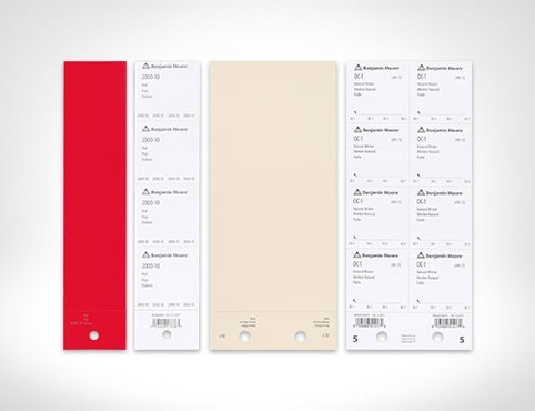
Order Paint Color Sheets
Streamline and simplify paint specification with the help of Benjamin Moore Paint Color Sheets.