Benjamin Moore’s Wellness Color Palette: Cultivate Serenity in Your Home
Benjamin Moore’s Wellness Color Palette: Cultivate Serenity in Your Home
Whether you want to paint a meditation space, spruce up your favorite reading nook, or simply breathe some Zen into your home, prioritize relaxation and self-care with our curated palette of colors for wellness.
Paint color has the power to affect our well-being and promote relaxation, and it can help us manage stress and find inner peace and tranquility. Although everyone has their own unique reaction to color, there are easy ways to determine the best color scheme for your individual wellness journey and mindset.The Benjamin Moore Wellness Color Palette
Prioritize relaxation and self-care with our curated palette of paint colors for wellness.


Cheerful Front Door Colors for a Friendly Welcome
When it comes to choosing colors that set a tone of health and wellness throughout your home, start at the beginning. The front door, although a relatively small area, makes a huge first impression. To extend a genial welcome to family and friends, use a happy hue like Sunny Days 172, which has a touch of marigold undertone for year-round cheer.Whether you choose a warm or cool hue, an eye-catching front door color ushers visitors into your home. Here are some other bright, wellness-inspiring paint colors we love for front doors:

Meditation Space Ideas & Colors for Wellness
When bringing wellness colors into your home, think about the hues that make you feel calm. Blue is one of nature’s neutrals and a globally favored hue thanks to its soothing properties. A popular choice for relaxing bedrooms, blue paint colors can help you reset and reenergize—two important parts of self-care.Soft gray-blues, like Smoke 2122-40, Intuition CSP 610, and Colorado Gray 2136-50, shown here, are perfect for any space where you want a mindful atmosphere. For more tips on using blue paint colors to set the mood in your home, check out this video from renowned interior designer Paloma Contreras.

Kitchen Colors for Health & Wellness
What better space to anchor your wellness color palette than the kitchen? Whites, neutrals, and reds have long been classic kitchen choices, but if you want a color scheme that bridges the gap between soft and saturated, we have a suggestion for you: pink!No longer relegated to the nursery or powder room, soft pink paint colors bring a gentle, playful side to any space and offer boundless versatility in rooms that are essential to your health and wellness. Some of our favorite peaceful and nurturing pinks:
- Love & Happiness 1191, the signature hue of Well-Designed, an organization that facilitates meaningful wellness and learning experiences for the interior design community.
- First Light 2102-70
- Dusty Trail 1157

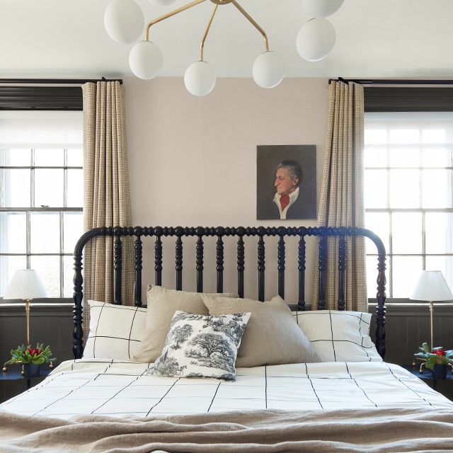
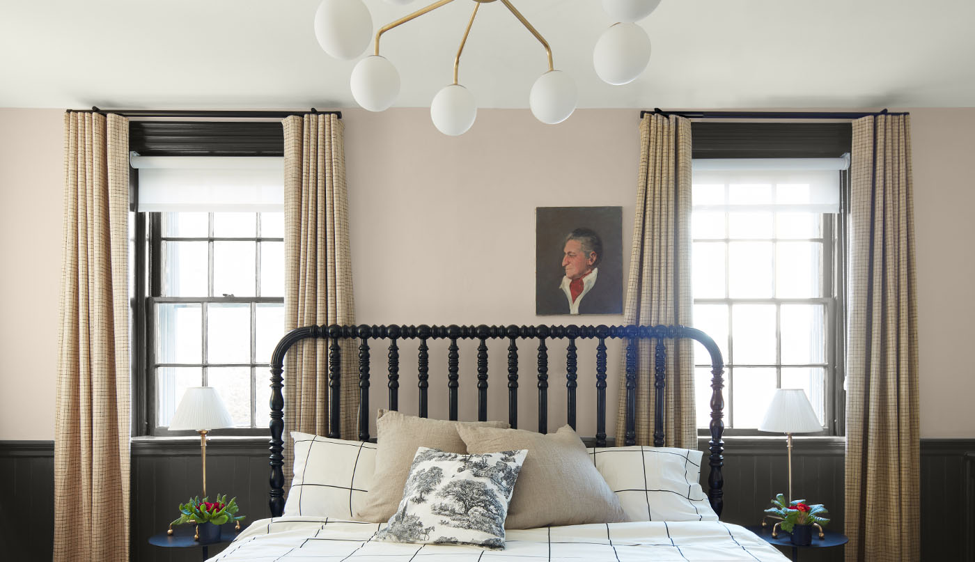
Calming Paint Colors for Bedrooms
When it comes to bedroom paint colors, you may find that a more saturated hue is too bold for rest and relaxation. Instead, use a deeper hue on an accent wall and paint the rest of the room in your favorite neutral. Whether you choose a taupe, greige, or light brown, neutral hues are gentle and inviting, ideal for deep sleep, long mornings, and quick naps.With its hint of warmth, Stone Hearth CC-490, shown here, can bring surprising depth and texture to a space. We also love these neutral colors for wellness:

Colors You’ll Love for Self-Care Spaces
No matter where you take a few minutes to reflect during the day, find equilibrium in your self-care space with a complementary color scheme that helps to promote wellness. Whether it’s a meditation room or a home gym, play with pale and pastel tones that sit across from each other on the color wheel to create a peaceful, calming vibe. A few color combinations we love:- Green Tint 2139-60 & White Opulence OC-69
- Angelica AF-665 & Battenberg AF-70
- Palladian Blue HC-144 & Inner Peach 1150

Relaxing Paint Colors for Mindfulness
Universally beloved for their ability to immediately calm a space, white paint colors remain some of Benjamin Moore’s most popular hues. With undertones that span the rainbow, white paint colors can be used to create a hygge-like atmosphere that lets your personality shine through. Go with timeless neutrals for a minimalist design style, or lean into a more contemporary look with a soft touch of color.To help ease the process of choosing a paint color—especially when creating wellness spaces—we encourage you to find peace of mind before you paint. Book a Virtual Color Consultation to get tailored color recommendations from our experts. Explore our variety of color samples so you can view your favorite hues in different lighting, observing how the color takes on different tones throughout the day. Shop online or visit your locally owned store to get started.
Frequently Asked Questions
What are the best paint colors for wellness spaces?
Whether you want to paint a meditation space, spruce up your favorite reading nook, or simply breathe some Zen into your home, the best paint colors for wellness spaces are the hues that make you feel calm and relaxed. Blues and greens are popular choices for their connection to nature, while neutrals are incredibly versatile and offer a host of choices to go with any décor or design style.
How do I create a spa-like atmosphere in my home?
Make your self-care spaces feel spa-like by sticking to a minimalist design style and leaning into natural décor—think teak, marble, and anything that offers both indulgence and function. For extra luxury, use Aura® Bath & Spa Interior paint—Benjamin Moore’s ultra-premium, matte-finish bathroom paint—for unparalleled color beauty in high humidity.
What colors are associated with wellness?
Many paint colors are associated with wellness. Blues and greens help to bring the energy of the outdoors into your home (think fresh air, blue sky, and other earthy elements), while yellow and red bring a welcoming warmth to many shared spaces.
For a slightly different take, try a pale pink, which offers the versatility of a neutral with a soft touch of color.
Can I use bold colors in a wellness space or meditation room?
There are no rules when it comes to using bold colors in self-care spaces—the hue you choose should be the color that makes you feel most at ease. If you’re thinking about bringing a deeper color into your wellness or meditation space, you may want to start with an accent wall or use a jewel-toned hue like Hale Navy HC-154 or Hunter Green 2041-10.
What are Benjamin Moore’s most calming paint colors?
Calming paint colors can be found in nearly every color family, but some of our favorite relaxing hues include Pale Oak OC-20, Palest Pistachio 2122-60, and Porcelain 2113-60.
To help ease the process of choosing a paint color—especially when creating a wellness space—we encourage you to test-drive with color samples so you can have peace of mind before you paint.

Order Color Samples Online
Buy one or more color samples to help finalize your choice—and ensure peace of mind.

Paint Colors by Zodiac Sign
What does your place in the sky say about your personal color palette?

7 Colors for Wellness & Health
Explore the seven paint colors selected by Well-Designed and see how each one syncs with the seven key pillars of wellness.