Decorating with Blues and Greens
Paloma Contreras Explores These Two Popular HuesRead What Paloma Contreras Has to Say:
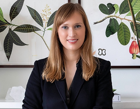
Interior designer Paloma Contreras shares her approach when decorating with blues and greens, all from her Houston store, Paloma & Co., located next to her design firm.
"One of the most important topics that I discuss with clients is on color and deciding upon a color palette. This is one of the very first things that we typically do when starting on a project and I typically ask clients what their favorite colors are, what mood they want their space to evoke, how they want to feel in that space and essentially how they like to entertain, because color plays into all of those things," counsels Contreras.
"If you desire to create a moody space or a more formal space, you may go with darker colors, like an Aubergine chocolate, navy, or a moss green; if you want space that feels a little bit more soothing, calm and peaceful, while still inviting, you might choose from softer pastels, sky blue or sea green."
Contreras discusses the decision making that goes into each project. “When deciding design direction for a project, I'll ask those same questions: think about how at the end of the day you want to feel in those spaces, what mood do you want to feel when you spend time in a particular room? And to that end, one of the most popular color combinations that we use are our two most requested colors, blues and greens. And this should not be a surprise given their universal appeal as flattering colors and ones that everyone seems to like. And another plus, the entire family of blues and greens are drawn from nature.
"They're naturally occurring colors, the color of the sky, color of the sea and they have a broad appeal to many people. Blue is the color of the ocean, it's the color of classic elements like a crisp navy blazer and striped t-shirts, things that evoke a sort of timeless palette and green can be anything from a beautiful meadow to a perfect army green jacket. We determine what these colors mean to our client and how they relate to the colors themselves, and then build our palette."
Another outstanding attribute of blues and greens, according to Contreras, is their broad range of hues within the color family. Green, for example, offers anything from chartreuse to the deepest, darkest olive green and each evoke a different mood. Contreras shares that when she wants to inject a space with a sense of modernity and tension, she often turns to something like chartreuse. Electric and bright, chartreuse imparts energy to a space. Its yellow undertones pose a beautiful contrast to pure blues and greens.
“It tends to add that little bit of shock value or attention that a space can benefit from greatly,” adds Contreras. “I tend to love using it in an unexpected way with draperies or a wonderful set of pillows, or other design accessory. My go-to green is moss green, I love moss green. Personally it is one of my very favorite colors -- in my own home, I've actually designed my entire living room around the use of greens. I have a great set of moss green velvet sofas that I absolutely love and have built upon that with different pillows and textiles and have brought in pottery in different shades of greens. To me, it feels like I'm bringing the outdoors in. While it’s calming and soothing, at the same time there's a bit of heft in the color palette, adding some drama that makes the room feel cozy.
“If I had to choose the color that we use most frequently in our design work it would be blue and it can run the gamut from the deepest, darkest navy to the palest sky blue, depending on the client and depending on the mood that we're choosing to evoke in a particular space. So if we're working on a beautiful bedroom, then we might choose really soft, pretty blues, watery blues, aquamarine, things like that to set the tone and make the space feel really calming, soothing and inviting. But in other spaces where a family tends to gather, like a family room or a kitchen, a game room, spaces where you really have interaction between various generations of the family, we're going to use things that feel really crisp but classic and also just have a little sense of fun. So we'll typically mix shades of navy with maybe cobalt and some lighter blues, really bring in some wonderful textiles. Sometimes we'll paint a space a really great shade of a darker, deeper blue to evoke a sense of coziness. So it's a color that people just can't seem to get enough of.”
Contreras shares that for spaces where she needs to be creative and design constantly, she wants a neutral backdrop. In her shop, all the walls are painted with her favorite shade of white, Benjamin Moore White Dove, as it evokes the ideal peaceful vibe that she and her team need to support their clarity when designing. “It is the perfect backdrop, no matter the merchandise on display or the project work being done,” notes Contreras.
“If you're constantly having to shuffle back and forth between a very feminine sort of colorful project, say in Palm Beach and more monochromatic clean lined, masculine project on the East Coast, you have to be able to toggle between the two very seamlessly. And I think having a neutral backdrop allows us to do that. It just sort of frees up my mental space in order to be able to be as creative as I need to be. And in the store, it gives us the flexibility to change things out frequently and offer different things, whether it's art or accessories. While we bring in a lot of items in blues and greens because they're the most favored by our clients and what people choose to purchase, it’s not a perfect science. But we've listened to what people want and they seem to want blue and green all the time so the neutral background allows us to change things up and there is not visual conflict.”
Using Textiles and Color to Evoke Mood in Interior Design
When formulating the design story for a particular space, Contreras tends to start with a beautiful textile. Scheming with fabrics helps her identify what she terms her “anchor fabric or hero fabric, and that really serves as a springboard for the rest of the room and the rest of the design.
“What I do from there is look at the colors in that particular textile. Depending on the project, it may be a beautifully printed fabric. It could be something that's embroidered or woven and I look at the different coloration within that textile and use that as a springboard, not only for the color palette in the room, as it will inform the ultimate choice of paint color, drapery fabric, but also how do we complement that particular piece of fabric and bring it to life. So I'll add in or layer in complementary fabrics, whether it's for pillows or throws, any sort of accent upholstery in the room based upon the colors that I'm seeing there and then build interest as we go. It also informs the final selection of art in the room and different accents, whether it's pottery or the books that we're using on the shelving in the space, it really informs everything and becomes the common thread that brings the entire room to life.
“Whether you favor blues or greens, you need to be thinking about the different mood that you want your home to evoke and how you want it to really feel when you're living there in order to determine the final color selection.” There are a variety of things to consider first and foremost, such as lifestyle, how you want to live in the home and how you want your guests to feel in your spaces. “Several years ago we did this beautiful lacquered library with Benjamin Moore’s Water’s Edge, and it’s still a favorite of mine.
“To this day, the clients say that they spend the most amount of time in that room because it provides them with a sense of calm and peace and their little girls love to spend time there too. For other clients, they may want a space that feels really geared towards entertaining and is a little bit bolder, has more energy. And so we might do something for them like a bar or a gentleman study in a really cool shade of army green. Navy also has always been a favorite and can run the gamut from feeling super classic and bold and masculine to being a neutral moody backdrop. All depends upon your particular vibe and the mood that you want to feel in your home.”
Although clients often view final paint color selection as a stressful decision, Contreras says you shouldn’t worry too much. “At the end of the day, one of the great things about paint is that it's actually really easy to work with. It just takes a little bit of trial and error and you’ll not incur a massive expense to test colors. Regardless of the project that we're working on, even as a professional designer, I never select just one color for a client. I always give them a range of two to three colors and we test them. We either have our painter mock-up swatches on the actual wall, or you can also order these great sample swatches – Peel & Stick - that stick on the walls and can be moved around, which is fabulous. I encourage anyone to take some time before jumping into a decision and live with the different colors throughout the day for a minimum of 24 hours since time of day, the light, is a huge factor.
“It impacts the way that color reads on a wall dramatically. It changes throughout the course of the day as the sun changes, the light changes in a room. And you may think that, you may be familiar with certain rules that may say that some colors are okay to use in certain spaces and others aren’t, but rules were made to be broken at the end of the day. See what works well in your particular space, what feels good to you and what looks good on you. So even though one person may not look great in a green room, the next person may look fabulous in it with the right color. If you love it, it will work.”

Color Families
See our most popular paint colors from each color family, get design tips and more.


Inside Design
Explore distinct design topics from the interior designers featured on this page.