The Colour Handbook A Guide to Selecting Paint Colour
Tackle your design project with confidence thanks to these essential pointers to finding the perfect paint colours.
Colour really does make the room. The perfect shade and finish can enlarge a small space, bring in more light, or deliver that kick of energy you need with your morning coffee. But finding the right one? Now that’s another story.
Take a brief tour of the colour wheel here!
Colour Wheel Insights
Take a look at the colour wheel colours in totality: Warm reds, yellows, and oranges on one side; cool lavenders, blues and greens on the other. Creating a palette within the same half of the wheel tends to be more harmonious. Pairing two colours opposite one another adds a dash of invigorating tension. Which do you prefer?Key colour wheel terms:
- A monochromatic colour scheme uses tints and shades of the same colour.
- An analogous colour scheme uses adjacent colours on the colour wheel.
- Complementary colour schemes (as in "opposites attract") include two colours that are opposite to each other on the colour wheel.

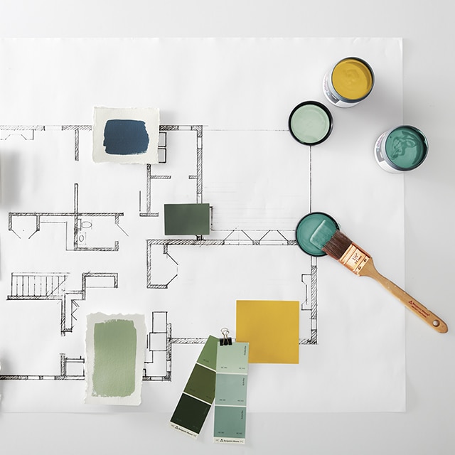
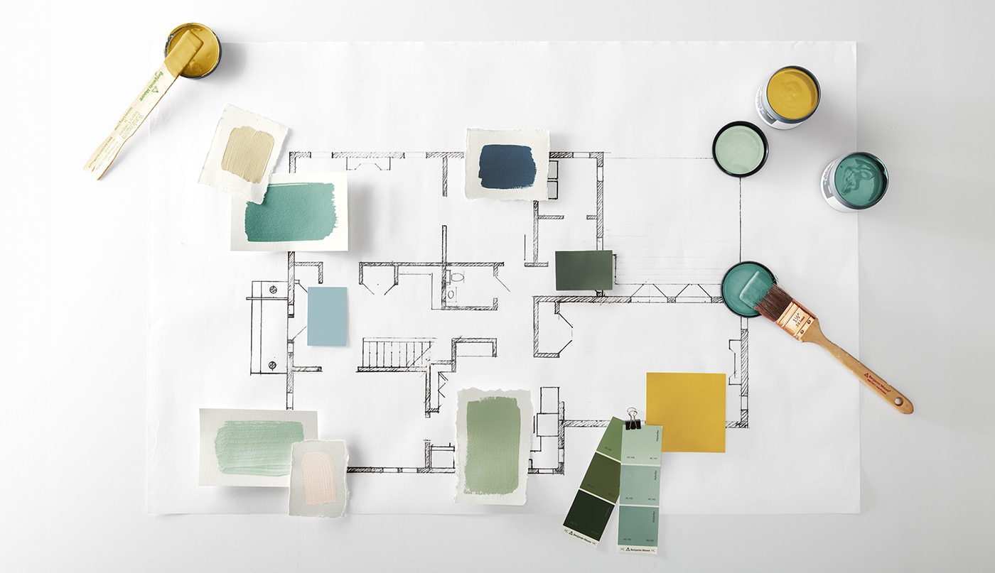
Selecting the Perfect Room Colour
These three categories are a great starting point to help identify your personal colour preferences:- Pales: Ballet pink, dusty lavender, washed out blue—light, airy combinations that lift you up
- Neutrals: Slate, clay, sand, ochre—natural combinations that keep you grounded
- Deeps: Violet, onyx, sapphire, ruby—confident colours that create instant character
Learn about the emotional impact of these colour categories in The Psychology of Colour.

Accent on Trim
Painting trim in glossy white is a classic choice, but why not go beyond white or cream? Choosing a trim colour—think Black Satin 2131-10—against a neutral wall is a striking way to showcase a room’s unique architecture.Consider an ombré colour scheme: Paint walls with different shades of one colour, keeping the darker hue closer to the bottom for a beautiful effect. Here, we use Green Grove 2138-20 on the base molding, Briarwood HC-175 on the lower wall and Bleeker Beige HC-80 on the upper wall.

The Theatre of Light
Light in a room changes many times throughout the day.From the natural light of early dawn to the artificial light of nightfall, the relationship between light and your chosen paint colour is a crucial consideration. As seen here:
- Top: Direct midday sun will brighten up any hue
- Lower Left: That same hue is flattered by softer, indirect illumination.
- Lower Right: Artificial light adds a warm glow to wall colour.
Buy a Benjamin Moore paint sample to experience paint colour in real-time, from morning to night.
Test. Observe. Repeat.
Experimenting and observation is key when it comes to selecting paint colours for home interiors.To make sure you choose a colour with confidence, buy colour samples at your local Benjamin Moore retailer. At home, paint a board–foam core will do nicely–and move it around to different parts of the room. Monitor how the paint colour changes at different times of the day so there are no surprises.

A Look at Paint Finishes
Selecting the right type of paint finish can enhance paint colour. Top design tips for sheen selection include:- Higher gloss adds dimension and levity to any room.
- Shiny finishes look best on smooth, clean surfaces (spackled, sanded, etc.).
- Matte or flat paints are most forgiving of imperfections.
- Eggshell offers a perfect middle ground between a matte look and higher-gloss durability, making it a go-to, all-purpose finish perfect for high-traffic areas.
Visit a local Benjamin Moore retailer to pick-up a paint sheen chart you can take home.
Get insights on how sheen impacts paint colour.
Sheen 101
Sheen puts the finishing statement on your colour of choice:- Flat–Low sheen, very forgiving
- Ulti-Matte/Eggshell–Durable, flexible for most parts of the home
- Semi-Gloss–Luminous finish that highlights architectural details
For more tips and insights, check out our step-by-step guide on how to select the right sheen.

The Colour Handbook: A Guide to Selecting Paint Colour
Visit one of the 7,500 locally owned and operated Benjamin Moore stores, and pick up your own copy of The Colour Handbook: A Guide to Selecting Paint Colour for more inspiration.Get more step-by-step guidance on selecting colour on our How To section.