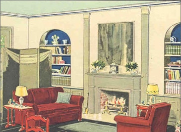
LIVING ROOM COLOR SCHEMES
"Color Will Work Wonders" - 1930
A touch of deep blue on the back of built-in bookcases enlivens this 1930s living room.
"The secret is color [which] will work wonders," advises a circa 1930 Benjamin Moore color brochure titled Fountain of Youth. "Harmonious colors of paint on walls, ceiling trim and floor with the right accents in furniture, rugs, lamps, drapes, and accessories" make for a beautiful living room.
The scheme includes a light blue ceiling, cloud gray walls, French gray trim and wainscot, a black painted floor and a gray green rug. High points in color are the red upholstery and the touches of bright blue on the built-in bookcases.
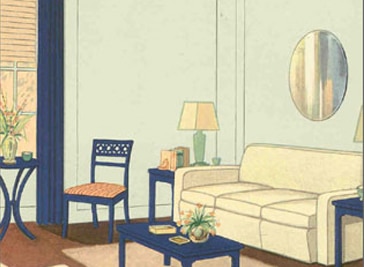
Quiet Blue and Peach - 1938
Blue walls and peach ceiling is the color recipe for this living room around 1938
In this living room, featured in a Benjamin Moore color brochure around 1938, the painted coffee table, side chair and lamp tables sport Royal Blue Utilac® enamel paint. But the powder blue walls, as well as the trim, peach tint ceiling and painted Venetian blinds, are rather quiet.
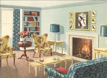
Saturating with Color - 1948
Homey and welcoming, this 1948-era living room features a color scheme of aquamarine with blue and shades of yellow
After the Second World War, the color palette used in homes brightened as it seemed that homeowners looked to cast off the drabness of the war years and wanted to saturate their home with color. The color scheme focuses on several shades of aquamarine for ceiling and walls and trim. Colorful home accessories include printed draperies and upholstery fabrics.
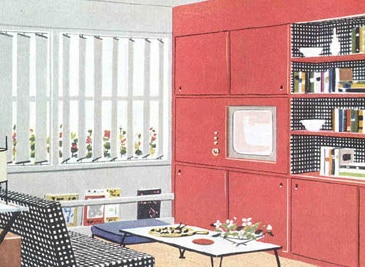
"Color Opens The Door" - 1954
Red, white and black is the sprightly color scheme of this postwar informal living room
"Color Opens the Door" proclaims a Benjamin Moore consumer brochure from 1954. A sprightly black red and gray color scheme puts this room in the distinctively modern camp as do the vertical blinds. The television set is a relatively new item. The black-and-white check of the sofa upholstery is picked up in wallpaper or possibly fabric lining the open shelves of the wall unit.
Coordinating Paint Colors - 1970
Fabrics and bright blue painted wall were bound to look great together since they were coordinated to go together.
This Benjamin Moore advertisement appeared in shelter magazines in 1970 when coordination was a popular buzzword in decorating. The advertisement ties in Benjamin Moore paint colors with textiles from a fabric company. The idea? Through use of custom colors, consumers could coordinate paint colors to any fabrics they desired.
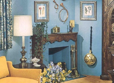
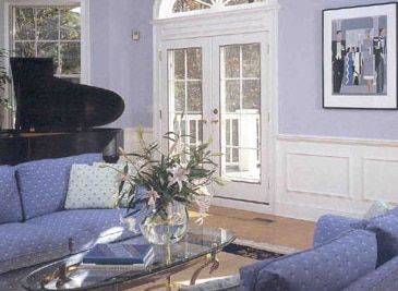
AquaPearl® Living Room - 1988
Several shades of blue create a lively yet restful living room with a touch of traditional grandeur in the fanlight over the French doors and the grand piano
In the late 1980s, Benjamin Moore introduced Regal® AquaPearl paint to the marketplace in response to the need for a soft pearl-like sheen level for interior paint. The paint on this 1988 Benjamin Moore color card is described as rich and elegant, yet practical with its durable, spatter-resistant, scrub-able surface.
The pictured room is large enough for a grand piano and two sofas and featured a vaulted ceiling - certainly a setting that is rich and elegant to go with the new paint finish.