
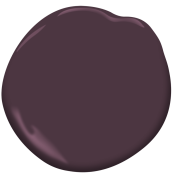
“There are so many Benjamin Moore colors I love, but one I come back to time and again is Dark Purple 2073-10. It is a color that reminds me of my mother’s favorite dress when I was a small child, as well as my grandmother cooking dinner—often with ingredients like aubergine and purple onions. It’s a color I lived with daily that holds memories of love, family, and beauty.”
Spotlighting Design Visionaries During AANHPI Heritage Month


Spotlighting Design Visionaries During AANHPI Heritage Month
Benjamin Moore is celebrating Asian American and Native Hawaiian/Pacific Islander (AANHPI) Heritage Month with a one-of-a-kind collaborative color palette curated by members of the AAPI Design Alliance (AAPIDA).
Discover Benjamin Moore color inspiration and delve into this stunning 12-color collection from luminaries at AAPIDA, an organization and collective that engages, promotes, and empowers Asians, Asian Americans, and Pacific Islanders working within the home and design industries to foster visibility, collaboration, and representation industry-wide. Learn more about the organization’s mission and how you can support it by visiting the AAPIDA website.Each hue in the Benjamin Moore x AAPIDA AANHPI Heritage Month color palette was handpicked by a different designer, drawing inspiration from family, culture, and global design.
Grace Lee-Lim
Grace Lee-Lim

CW-475
“My favorite Benjamin Moore color is Palmer Green CW-475 because it’s a deep shade of green that has a hint of brown infused, which is a color reminiscent of a lot of the landscapes in Korean minhwa paintings. I’ve utilized this paint color for several projects in the past and it always brings a sense of warm, opulent moodiness that envelops a room.”
Hema Persad
Sagrada Studio


2053-20
“My favorite is Dark Teal 2053-20! It’s a super nostalgic color for me, because in Indian culture we dress very colorfully and teal is a color you see a lot in our outfits, home decor, and even on buildings and temples. We also love a peacock moment, and at my wedding teal was a color I used and wore. It’s just a color I grew up surrounded by, so it feels normal to me and not like a bold choice at all.”
Jessica Davis
Atelier Davis


“My favorite Benjamin Moore color (right now) is Morgan Hill Gold 189. I caveat that with ‘right now’ because it’s always changing! But I am super into ochres and golds right now. The color is so rich and can act as a neutral while still being super saturated. It pairs well with florals, as well as animal-print items like a Tibetan tiger rug.”
Linette Dai
Linette Dai Design

CSP-420
“My selection for the Benjamin Moore x AAPI-inspired color palette is Velvet Plum CSP-420. I love this color because depending on the context, it can either act as a complementary neutral when paired with a more dynamic color or be a rich yet elegantly understated color on its own. For me, it is reminiscent of the harmonious and mutually supportive nature that is often encouraged in our Asian heritage and communities.”
Noz Nozawa
Noz Design

465
“My favorite Benjamin Moore color changes all the time, but in honor of AAPI / AANHPI Heritage Month, Antique Jade 465 reminds me of the jade bracelets and pendants that many of our East and Southeast Asian mothers and aunties have worn for generations. I've also just painted a room in our home this color and I love how it pairs with hues of orange-reds and bricky browns—colors that also remind me of my pride in being AAPI.”
Nureed Saeed
NU Interiors

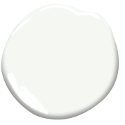
OC-65
“One of my favorite colors has been and continues to be Chantilly Lace OC-65, a versatile classic that looks new and fresh every time. I have used this color for clients in both New Jersey and California, so whether it is Eastern sunrises or Western sunsets, it works everywhere. Perfect for any space, I love how Chantilly Lace reads bright, yet warm, spacious, yet inviting. It is the ‘Goldilocks’ of white paints.”
Peti Lau
Peti Lau, Inc.

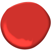
2002-10
“One of my favorite Benjamin Moore colors that I loved when I first started out and I would call it my ‘signature color’ is Vermilion 2002-10. It brings so much energy in and completely transforms a space when I use this color. Historically, the brilliant and distinctive red of vermilion has been used extensively across thousands of years of art history, from the art and decoration of ancient China and Rome through to the manuscripts of the Middle Ages and the paintings of the Renaissance.”
Seema Krish
Seema Krish

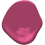
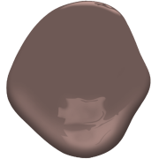
CSP-440
“My favorite Benjamin Moore color is Berry Fizz CSP-440. I love this color because it reminds me of the Indian ‘rani pink,' which is more than a color, but an emotion of joy! The legendary fashion editor Diana Vreeland once proclaimed, ‘Pink is the navy blue of India!’”
Sindhu Peruri
Peruri Design Company

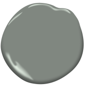
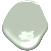
HC-163
“Duxbury Gray HC-163. It’s a ‘pseudo-neutral’ color in my opinion. It’s gray, but has a wonderful and soothing green undertone, and generally works on walls, cabinetry, and millwork. Like a neutral, you won’t get tired of it, but it’s more interesting. It’s a crowd-pleaser and works in modern or traditional settings.”
Timothy Truong
Matte Black | Off White


2155-30
“Yellow Marigold 2155-30. I’ve always gravitated toward mustard-like hues. Not only does it evoke feelings of warmth and comfort but there is a nostalgic tie-in. This hue reminds me of comforting home-cooked meals, or the golden glow of autumn afternoons. Often when I do get a chance, I try to incorporate subtle hints of this color into design. The color can be bold but somewhat of a muted accent if thoughtfully incorporated.”
Tuan Nguyen
Nouveau Design House


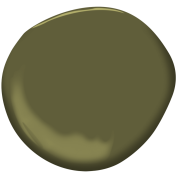
2146-20
“My current color obsession is Forest Moss 2146-20. It is a rich muted chartreuse green that evokes a sense of calmness yet still invigorates a space. It pairs well with dark moody colors as well as light neutrals. I’ve used it in multiple projects (including my primary bath ceiling) and it knocks it out of the park every time.”
Show Your Support
Become a member, volunteer, or contribute to the mission of the AAPIDA.

Why You Need an A&D Rep
Our reps act as dedicated partners, readily available and collaborating closely with designers and architects to ensure a project’s success.

Color Palettes
Get downloadable color palettes for a range of design programs and software applications.