Creating A Color Palette for Your Home
Kristine Paige Talks Hues for the Whole HouseRead What Kristine Paige Has to Say:
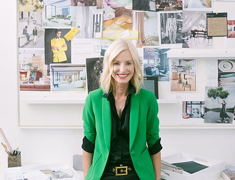
Interior Designer Kristine Paige discusses her formula for creating a palette for the whole house from her studio in West Hollywood, California.
“For me, it is so important that my clients feel instantly at home in their new environment. And so what I ask of them at the beginning of every single project is to give me an item or show me an item of theirs that they feel completely relaxed and beautiful or elevated in. And I love to take that item and I love to then create a whole house palette from that item.”
Sharing one her favorite items, “This is a Marc Jacobs scarf that someone gave me as a gift. So not only is it important to me, but I absolutely love this color palette. I don't think that I would have come up with this color palette on my own, but I found this and it was such an inspiration. So in this palette, we have a beautiful lavender, but it has a pink undertone to it. We have a great rust color. We have a warm kind of latte color, and then we have a great black, strong black. So a few things we could do with this palette right off the top of my head would be painting your doors and windows with the black, kind of like I've done here in the studio.”
“Instantly it draws your eyes into nature. So you bring all the colors of nature into your project. The other thing we could do is take this lavender color and although it could be very feminine if you use it in abundance, if you add just a bit of it to a white paint, you're going to get this beautiful glow in the room, and it's going to make everyone that goes into your room just look stunning. And the rust color, here's the interesting thing about the rust color in this scarf. It is a very clear, honest rust. However, because it's so close to this lavender and the pink undertones in it, I've paired it with burgundy. And I think it just looks beautiful, especially here in this tweed where the burgundy has some of this latte color coming in. So there's so many ways to take an item of inspiration and just extrapolate from it and take so much information.”
Paige also illustrates how viewing the color inspiration with surfaces that are in the house–perhaps oak flooring–brings out the color. “You have to look at all the surfaces in your house. You can't just stop and think of, ‘Oh, what color am I going to paint my walls?’ Which is what a lot of people do. You have to think, ‘What color are my floors, if I'm not going to change them?’ How am I going to draw out all of the colors in the floor and make that just marry and compliment the colors on my walls? So for instance, we have this beautiful color on the floor. Then we can take that into our surfaces. I absolutely fell in love with this stone when we were at the stone yard for one of my projects. But if you bring this into this palette again, not only does it bring a lightness to that latte color, it adds texture.”
Paige shares why it’s important to have a mix of textures in all of your projects. “You don't want things to end up flat. You don't want things to be of one note. And I think that's where a lot of the more elevated design comes in is, when you have varying texture in the room.”
Paige continues to advise, “So we've got our travertine, we have our stone, we have some fabric. I also look at wall coverings again with our inspirational item. And in this case, we have a beautiful tea leaf and it's been stained this dark, dark, almost burgundy color. It can almost appear black unless you put it next to something light. But next to the colors from the scarf, you can really bring in those dark plum tones.”
Paige continues to advise that “another item that I love to look at with my inspirational items are cabinets. So often people don't even think about their cabinets, especially if it's a remodel. And whatever the cabinet surface, it doesn’t affect how you look at the color.”
“Choosing a mauve purple is beautiful with the inspirational item, and the brass tonality brings up the latte color again. There are so many ways to bring in these colors that you would never really think about. You have to approach it in terms of a whole house palette, not just color on the walls. My absolute favorite tool is using my Benjamin Moore Color Reader with the Benjamin Moore Color Portfolio® app. It is a lifesaver, it is fabulous.”
“Place it on your inspiration item, press the button and all the colors that are suggested matches come up. I mean, how terrific is that? So now I know exactly what colors to try on my wall. Because obviously they gave you such a nice range of color because every project, every wall, every room has different lighting and lighting is everything when you're picking a paint.”
“When we actually go to present to our clients, all the materials which we drew in for inspiration and picking a palette we’ve narrowed down, made it all clean and beautiful. We have renderings, we have drawings, we have storyboards. We bring everything to them in a very concise, clean, and beautiful way. And we present to them a beautiful palette based on something they love.”
“And because what we have is based on something that they love already, I know it's going to feel familiar to them. I know that they're going to feel confident in us, that we listened to them. I know that they're going to want it in their house. And it helps me go into every presentation, just knowing that it's going to succeed. I mean, we might have to change a few things. We might have to introduce a couple other elements that we hadn't thought of, but generally speaking, you walk into these meetings and you just feel such a sense of confidence because you're bringing in items that they already love. Generally speaking, because we've listened to our clients and we've integrated that thing that they care so much about. We know it's going to be a home run. So we feel incredibly confident.”
So confident that Paige doesn’t show her clients a fan deck. “Our clients are hiring us in order to narrow down these decisions for them. We need to make this process as easy as possible for them.”
And Paige does make it easy, or at least, she makes it look easy. By taking an item of inspiration, and matching it with a proposed color palette, she is able to create a palette for the entire home. “Then you can play off the different tonalities. Maybe you want a deeper latte color. Maybe you want to bring out the purple, the lavenders. There's so many ways to go after you narrow down your basic color palette.”

How to Choose Interior Paint Color
Learn from the experts on how to select colors you'll love.


Inside Design
Explore distinct design topics from the interior designers featured on this page.