The Importance of Color in Interior Design
Timothy Corrigan & the Power of Paint ColorRead What Timothy Corrigan Has to Say:
In this video, distinguished L.A.-based interior designer Timothy Corrigan chats about the impact of paint color—and color as a whole—on home design.
“Color literally is one of the designer's most powerful tools,” says Los Angeles-based interior designer Timothy Corrigan. “Believe it or not, it can actually change the way you experience a whole entire space.”
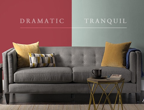
“Choosing a color palette for a room is actually one of the very first things we do after we've established the furniture plan,” shares Corrigan. “It really does help you set the tone and the mood for that room. So we use light colors in rooms where we want to make them feel airier and larger, and then tend to use darker colors in rooms where we want to create a more intimate and cozy feeling.”
Choosing a Color Palette for a Room
Corrigan likes to use strong, powerful colors in entryways, dining rooms, powder rooms, and guest rooms. Why? These are the rooms that you don't spend long periods of time in, so the color is never too overwhelming or too overpowering,” says Corrigan.
In touring a home he designed, Corrigan notes the use of strong primary paint colors including red, yellow, blue and green.
“White is used as the predominant color throughout this house so as to tie it together and bring a sense of cohesion,” the designer shares. “Then we added select primary colors in specific rooms.”
Heading into the dining room, Corrigan says: “We really wanted to create an atmosphere that was rich and dramatic, but also provided a lot of intimacy. We achieved that by using very saturated, dark colors. Whether it's the red wall covering or Benjamin Moore’s Deep Royal 2061-10 on the wainscoting down below – they each evoke the drama we wanted to achieve.”
A good dose of cheer is also a part of the dining room’s design. After layering in all the different colors—paintings, decorative glass bottles, furniture—the atmosphere is set for an enjoyable, relaxing experience.
A fun vibe can even be found in the home’s staircase. “Every single stair is in a different color, all the way from deep blue to the deepest of greens with a little red thrown in.”
With the kitchen located right off the backyard, Corrigan wanted to leverage the outside space using paint color to make it happen.
Citing Benjamin Moore’s Cat's Eye 2036-10, a brilliant bold green paint color on the kitchen island, Corrigan illustrates how paint color creates a fun atmosphere that draws people into the space.
“If I were going to summarize what I believe is the most important aspects of color,” notes Corrigan, “it truly is the ability for color to transform the way you experience a space.”
For fellow designers, Corrigan reiterates that carefully selected paint colors determine how clients will feel in their rooms. So choose paint color wisely.


Timothy Corrigan Inc.
"It's about getting people to feel a little more courageous to use color in their homes."

Inside Design
Explore distinct design topics from the interior designers featured on this page.