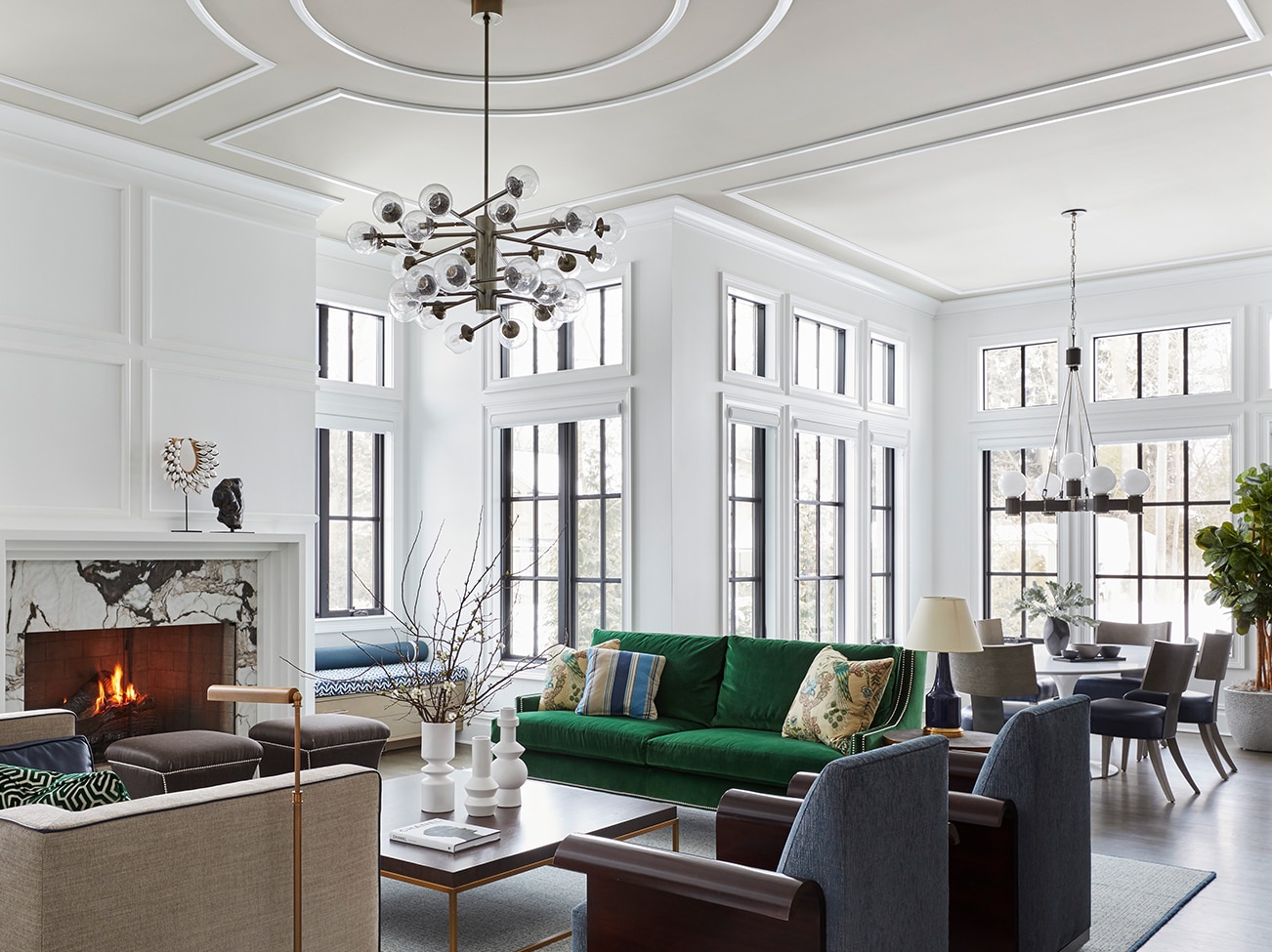
Known for vivid colors, layered patterns, and beautiful textures, Corey Damen Jenkins brings a fresh, dynamic approach to every project, creating architecturally inspired spaces that are polished, inventive and unexpected.
HQ: New York City, New York and Detroit, Michigan. Learn more at Corey Damen Jenkins and @coreydamenjenkins.
We sat down with interior designer Corey Damen Jenkins to discuss the role of paint and color in his design process as well as his new book, Design Remix: A New Spin on Traditional Rooms. Recently named to the prestigious AD100 for 2021, he is known for pairing classic style with contemporary elements.
Is there a primary inspiration that kick starts each client's journey?
Corey: When it comes to renovating a residence, especially if it's a historic home, I'll first look at the existing architecture for inspiration and to determine what needs to be done. If the house has a great historical story, architecturally speaking, 9 times out of 10 I will retain that. That being said, if it's a door, column, or some amazing wainscoting, and it's white, I may decide to paint it a bold color, like Benjamin Moore's Hale Navy HC-154. The idea is to celebrate what has been done successfully before, and then move that forward into the 21st century.
When it comes to building a new home from the ground up, you are presented with a completely open slate and have limitless design pathways. If your preference is Art Deco, or you want a very modern contemporary direction, those options are on the table.
How do you explore your client's personality and sense of style to determine the right design direction?
Corey: One of the best ways to interpret a client's personality and style is to go to their wardrobe. How people dress themselves, even the interiors they may select for their cars—these types of things tell you a lot about their personal comfort zone when it comes to color, texture and pattern.
That said, I believe a designer's goal should be to really move your clients at least 10–20% out of their comfort zone. If I'm delivering the exact same thing they already have, then I'm not doing my job.
"GOOD DESIGN IS NOT REALLY GOVERNED BY RULES BECAUSE RULES ARE MEANT TO BE BROKEN."
- Corey Damen Jenkins,
Principal, Corey Damen Jenkins & Associates

Your first book, Design Remix: A New Spin on Traditional Rooms (Rizzoli), makes its debut on March 23rd, 2021. What motivated you to write your book?
Corey: Quite simply, I had a desire to pull back the curtain around interior design for a wider audience, including design enthusiasts, professional interior designers, and people who may not be exposed to high-end interior design. I wanted to share the joy of everything that goes into what I do every day, and it's been a lot of fun.
The interior designs in the book range from traditional to contemporary, from Art Deco to Mid-century. My goal was to make it fresh, make it hip, make it sexy. There's also a wide swath of Benjamin Moore products featured throughout the chapters, underscoring the important role of paint in design.
Can you share how you use color in unexpected ways?
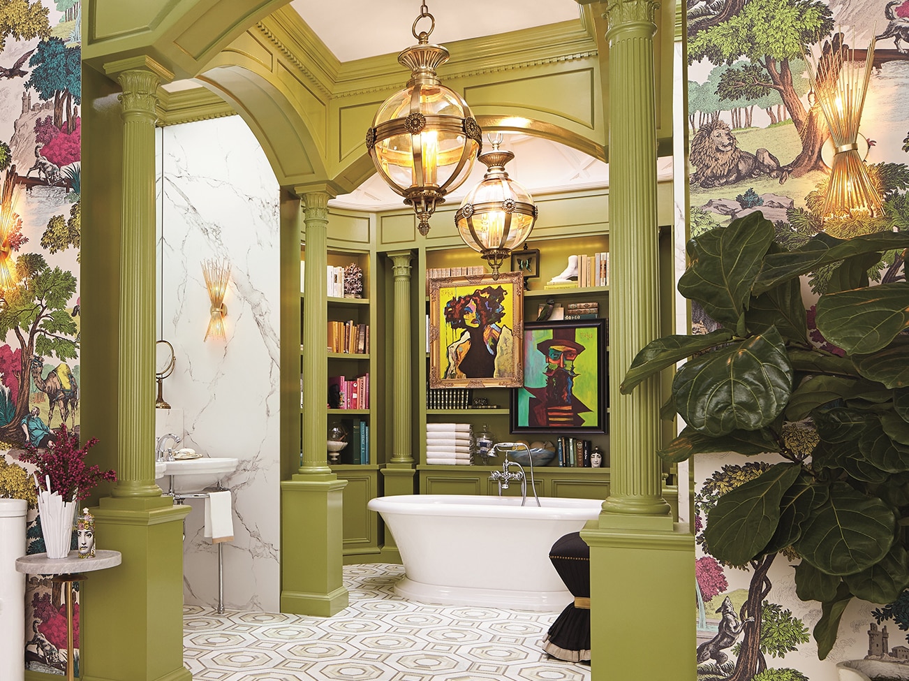
Corey: I like to apply a paint color and highlight all the doors throughout a house using an unexpected hue like aubergine or introduce an acid-toned lime green on Corinthian columns in an elaborate bathroom. Juxtaposing time-tested and true architectural elements with bold paint color makes it fresh, vibrant, and a tad off the beaten path. In the chapter "Bold Standard" of my book, Design Remix: A New Spin on Traditional Rooms, I also share various paint selection tips.
Can you share additional tips around choosing a paint color palette?
Corey: Often people paint the room first and then pick out their furniture. As I reference in my book, my suggestion is to wait to paint. Select your fabrics, window treatments, and furnishings first; then choose a bold paint color to tie in with the fabrics that you've chosen. Benjamin Moore has a vast color offering. You have lots of ranges and options to pick from, but it is unlikely you would have those exact color options from your furnishings and window treatment selections. So, wait to paint. Get your design concept identified first, then pull your paint colors together.
Corey Damen Jenkins
Designer Showcase
Explore Corey's colorful and classic style, including his luxurious Kips Bay Decorator Show House Ladies Library, a sophisticated and stylish room that showcases a stellar Benjamin Moore palette.
All of the photos in the Design P.O.V. series are courtesy of the interior designers featured. You can find paint colors like the ones pictured at
your local Benjamin Moore retailer.
How do you approach the mixing of varying design genres?
Corey: I always say "Good design is not really governed by rules because rules are meant to be broken." The best design centers around the principles of scale, of texture, of lighting, of proper space management and egress—these elements can be applied to any designed space. One can do traditional, contemporary, Art Deco, modern, whatever is called for, as long as you're using the proper principles.
How do you express personal creativity through your work?
Corey: I exercise my creativity through architecture and the palettes I choose when designing dynamic spaces. And the furnishings I select allow me to get really creative with a wide array of fabrics and textures and how they are to be interpreted in the space. Window treatments can also be leveraged for how they will adorn a space. Then, there is the oft-neglected ceiling, and the myriad of treatments that can be interpreted on that 'sixth wall.'
Why do you find ceilings inspiring?
Corey: We tend to focus on a room's envelope of four walls and the floor. Too often, design enthusiasts and designers alike ignore the ceiling.
My preference is to use the ceiling for a big statement. Unlike the walls and floor, the ceiling is the only plane in the room, geometrically speaking, which provides a full, unobstructed view. This presents you with the opportunity to make a big statement, to be appreciated by all. We all look up.
When developing a project, do you have a go-to color or a palette of must-have hues? What determines how bold you go?
Corey: My go-to is comprised of jewel tones. Emerald greens, sapphire blues, ruby reds, and, of course, the precious metallics of gold and silver. For me, they're timeless. And amethyst too, which historically denoted royalty. I incorporate them quite a bit. But while I may pitch an idea and provide a direction, ultimately it is the client's comfort zone that determines how far to take it, how bold to go.
How do you utilize paint in your design process?
Corey: If we are using a wall covering featuring a vibrant pattern, I'll pull a color from my paint selection that will complement the wall covering motif so it can be visually seamless. The beauty about Benjamin Moore is that there are so many choices; even if I can't find the exact hue that I'm looking for in the actual wall covering, I'm going to find something very close to it in one of the Benjamin Moore collections. Once everything is laid out on the color boards, the client can then clearly see the synergy between paint, motifs, and texture.

Is there a #1 design rule that you follow?
Corey: My #1 rule is to get very well acquainted with your measuring tape. Measure, measure, measure. I measure three times before I order or cut once. I know it sounds like a cliché, but I can't tell you how many times even professional designers will order something, and then realize too late it doesn't fit the space, through the door, or in the elevator. You may not always have a crane to lift it up the side of a high-rise. So, measure, measure, measure.
You are known for incorporating luxurious and refined materials in your work. What are some of your favorite resources?
Corey: I love to layer in great antiques into my projects. They're beautiful. They're classic. They've been around for a long time, so they're very well made, with a provenance and a history. It also speaks to my commitment to sustainability. I'm all about cutting back on waste, and if you can find a great antique sofa or table and maybe repaint or re-upholster them, that's one less thing that we have to use up the Earth's precious resouces to create.
If you were morphed into a color, what would it be and why?
Corey: Without question, emerald green since, for me green represents life. Our planet is carpeted with it; it makes me feel happy, invigorated and full of zest. I hope that my work and my personality, at least to some extent, also has that effect on those around me.
What top three words of advice would you share with those entering the interior design profession?
Corey: Work hard, don't be afraid of exerting elbow grease, listen more—talk less. The clients know what they want even when they say they don't. A designer’s job is to decipher not only what a client says, but what is left unsaid. If you're talking too much, you'll miss it. And be humble. Remember where you came from and where you want to go, and be nice to people and you'll flourish.

Design P.O.V.
See video interviews, get advice, and find inspiration from leaders in interior design.

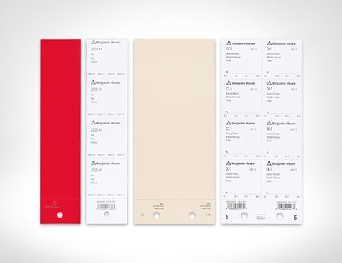
Order Paint Color Sheets
Streamline and simplify paint specification with the help of Benjamin Moore Paint Color Sheets.