What it Means to Be Bold with Interior Design
A Conversation with Jay JeffersRead What Jay Jeffers Has to Say:
From his San Francisco design studio, interior designer Jay Jeffers shares his professional insights around what it is to be bold with interior design. “It can mean so many different things. To me, it means taking some risk, having some fun in your home, but most importantly, I think it's infusing personal style. If it's your own home, making sure it reflects you, and that can be done in many different ways. Sometimes even more importantly, if you're a designer working for clients, it's even more important that you are making sure that this home reflects your clients' personality and who they are.
According to Jeffers, “Billy Baldwin, the great decorator from New York in the '60s and '70s, said, ‘If someone walks into a home and says, 'Billy Baldwin designed this home', then I wasn't doing my job,’ and I've always thought about that. I think being bold is something that you can really embody to infuse your own personal style and do it in a wonderful, fun, energetic way.”
“If you're a be bold novice, you might want to establish a language for the architecture in the house. If you're doing a remodel in a little bit more of a classic way, then build the boldness around it. But if you're ready to take some risk and do something different, then think about creating something that is going to still look good in 20 years.”
Jeffers aims to create statement styles that will stay current for many years. When working on an entryway, “the client had an apartment that was white walls, and he wanted to have an entry moment. So we paneled this entire room and enclosed the room a little bit, which is kind of contrary to what you might think, but paneled the entire room with some metal channels. And really, this is something that if he lives there for 10 years, 20 years, 30 years, it's going to still look interesting, be fun and modern and current.”
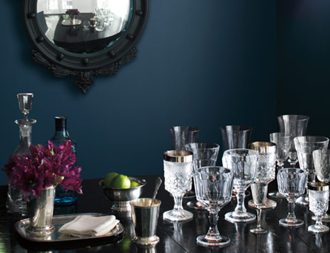
For a lacquered library, Jeffers opted for navy to create a look that lasts. “Now, if we'd lacquered it in a pink or a lime green or something like that, that might be something that we're painting in a few years. I think the boldness comes in the lacquer obviously, but navy is a fairly classic color and it's something that almost turns into a neutral in that space. So, that's a way that you can really be bold with architectural elements.”
When it comes to color, Jeffers receives a lot of calls from clients regarding what color to paint the walls. His advice? Be bold. “And it's something that, if you're tired of it in a few years, repaint. If you're tired of it in six months, repaint. It's not that difficult.”
When choosing color, Jeffers considers the desired mood in a space. Looking to amp up the drama, and make it sexy? Opt for darker, more saturated colors. In need of a bright, airy space? Use a pastel on the walls. Going bold doesn't necessarily mean choosing extremely bright or dark hues, it can be more subtle than that.
When selecting shades for a beautiful sunroom in Napa Valley, Jeffers had to consider its all-wood ceiling and minimal wall space. His solution included a bright, sunny yellow. “It's a beautiful color. It has a great energetic feel when you enter the room. And, if in five years the clients decide they don't want that sunroom anymore, all of the architectural wood elements are still there. They simply change out the paint color. It's that easy.”
For another client's residence, a beautiful entertaining space on the lowest level of the house was partially in the basement, underground. “Instead of this need for more light or to make it feel bright, I wanted to accentuate the dark, intimate aspects of the environment. While the walls were all wood, we painted the entire ceiling in a beautiful blood red tone, which brought the entire space together.”
On bringing bold choices into your home, Jeffers believes that “if you're starting in a room that is white, the best advice is paint really large swatches on the wall and thoroughly check out the paint color you’re considering. Be sure to paint it on a few different walls so it can be viewed in various light. If you are having someone paint it, literally leave and don't come back until it's completed.” One of the most frequent calls Jeffers receives from his clients is when they've seen a room halfway painted. When part of the room is white, it comes across a little bit brighter. Once you see the room completely painted and done, it changes everything. “And I guarantee, this has happened probably at least 90% of the time. I won't lie and say I've never repainted a room for a client, but 90% of the time, once it's done they say, ‘Okay, you're right. I love it. It's great.’ ”
Integrating Patterns, Artwork and Accessories to Create a Bold Look
Jeffers believes pattern is a great way to be bold in a space. “I think pattern on pattern is fantastic, and I think it can be done in a smart way. Start with a bold pattern. Whether it's a fabric, or maybe a pattern on a rug, but choose something bold and large and then vary the rest of the patterns throughout. If you have a room that has the same scale, same size pattern and you have three or four of those in a room, chances are it is going to feel a little overwhelming and there's no place for your eye to rest, so to speak. Maybe the draperies are a bold geometric fabric, then the rug–choose something that may have a little bit more of an organic feel to it and maybe the pattern is much smaller.
“For my apartment in San Francisco, I have a rug on the ground that is a pretty bold pattern. It's black and white and geometric. Part of the walls are painted in Benjamin Moore’s beautiful Deep Secret®, one of my favorite colors. While it’s just paint on the walls, it looks beautiful and there's art on it. There's one wall that's wallpapered, and a mural by Area Environments, that is almost like a watercolor painting. It's large and the strokes are big, and while It's a pattern it doesn't feel overwhelming.
“If you look at the photo of this room, you would say ‘Oh, there's a solid fabric on the sofa.’ But it's a herringbone. When you really look at it, you’ll see two colors, although it appears very solid. So, there's another pattern there. Now you've mixed a large organic, a repeating geometric shape, and a much smaller pattern.”
When it comes to artwork and accessories, “this is really a place where you can infuse personal style and be bold. I tell people, ‘If you're just starting an art collection for yourself, go and explore.’ I find art for my clients all the time, and sometimes people think that they don't understand how that's possible. Well, I'm not finding a specific piece of art that I love and putting it in their home. We're going to galleries and we're looking, and I try very hard not to offer an opinion and let them follow their taste. Sometimes I can't because something is just too good and they have to have it, and I let them know. But I try to just watch my clients and see what they're reacting to, and then I can direct them on other galleries and other artists.
“But it infuses your own style. Don't think for a second when you're in your home that you need to have white walls for your artwork to sit on. It's not true. I don't believe it. I think it does change the work, but once you buy a piece of art, you own it. So, you can do whatever you want. It can be bold and wonderful on a green wall, on a dark tone wall, any way you like to do it.”
“A great way to be bold and interesting is with family photos – I just do them in a different way,” said Jeffers, who prefers to convert family photos to black and white, frame them, and create a gallery wall in a master bedroom, or in the hallway leading to the kids’ rooms.
When asked “how do you know when being bold is too much?" Jeffers turns to the one and only Coco Chanel: "When you're leaving the house, look in the mirror and take one thing off."
“If you're a “be bold” novice, consider following Chanel’s advice. If you're working with patterns and you've selected five different ones, and placing them within a color palette or a fabric scheme, don't take away the largest and don't take away the smallest but perhaps pick something in the middle, remove it and replace it with a solid. Or, for example, if you have a really wildly patterned rug and you've got a pattern, even if it's a medium-sized pattern on the draperies, maybe take that one away and put it on something smaller like a chair and select a solid for the draperies.
“There may be a moment when, especially if you're new at being bold and taking risks, maybe you dial it back just a bit. Once in a while, I have to check myself. I have to look at things and I think, ‘Okay, I've got too much going on here. I'm just so excited about them.’ Take one out. Change it with something that is a little bit more neutral. Again, give your eye that place to rest, so to speak.
Remember, the last sentence in my book, ‘Life is too short to be boring. Be bold.’ "

Add Jewel Tones
Check out our palette of rich, saturated jewel-toned paint colors and get tips for using them in your home.


Inside Design
Explore distinct design topics from the interior designers featured on this page.