How to Create a Whole House Color Palette
Meg Joannides shares her approach to selecting interior paint colors.Read What Meg Joannides Has to Say:
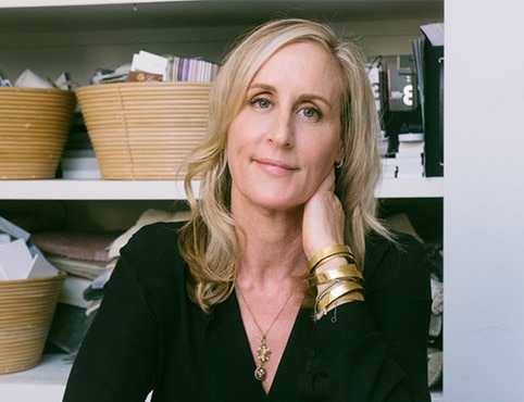
Meg Joannides, principal of MLK Studio in L.A., shares her approach to creating a whole house color palette during a visit to the Thomas Lavin Showroom in the Liaigre Furniture Gallery at the Pacific Design Center.
When identifying a color palette for the whole house, Joannides counsels that the first question she asks herself is “how are all the rooms throughout the house going to co-exist together?”
“As an interior designer, my goal is to create a flow, to balance all of the elements, furniture, window treatments, rugs, lights, materials,” says Joannides. “If you can think of it like a symphony where every instrument has its role, but together they create the music, the process starts with all of the materials and elements that are built into the architecture. After that we layer in the textiles, the furniture, the window treatments, the area rugs.”
Assessing Paint Color Preferences
According to Joannides, the topic of color is one she brings up early in the design process. “Clients, generally speaking, will have a preference for or against certain colors,” notes Joannides. “Taking into consideration a client's preference for color, and being able to implement that in a way that creates a harmonious environment, is definitely a challenge for every project.”
To illustrate how she has incorporated color on one of her projects, Joannides references a client who, while not open to bold color on walls or floors, was interested in saturated color in artwork and accessories. “They also felt that if they ever got tired of the color, we could take a painting off the wall, move it to another room and replace it with something different, giving them the ability to live with a new color without much disruption,” comments Joannides.
What else to Consider in House Painting
Another major impact on color is natural light, and what direction the light comes from. “We calculate how that light will affect any color that might be added to walls or color that might be on other surfaces such as ceilings or floors,” shares Joannides. “We take into consideration whether the room is supposed to feel quiet, serene or upbeat and happy. For example, in a breakfast room, we might use yellows, but maybe not in a master bedroom.” Joannides even takes each space’s region and view into account when selecting a paint color, to ensure the house features a co-existing flow and balance.
Joannides shares images of one of her projects, a beach house with an ocean view. “We find views such as these are hard to compete with when we're focused on the interior. So we've created a very neutral palette with highs and lows. It's our job as designers to make the clients feel comfortable with or without the use of color. And it's our job to be able to place it properly, to create and deliver a very successful interior.

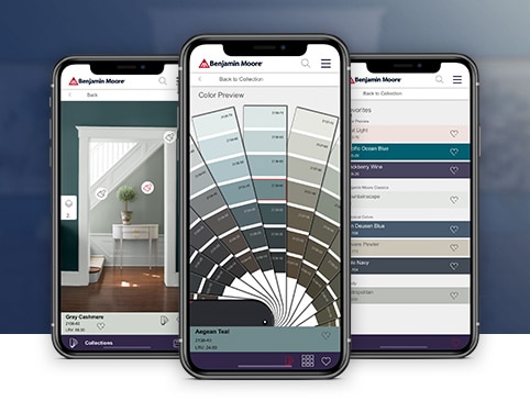
Benjamin Moore Color Portfolio® app
Apply paint color to photos of your space, access fan decks, match favorite hues to Benjamin Moore colors, and more.


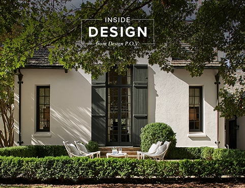
Inside Design
Explore distinct design topics from the interior designers featured on this page.