8 Ways to Bring the Outdoors In Using Paint Colour
8 Ways to Bring the Outdoors In Using Paint Colour
Healing and healthy, nature is a commanding force. By bringing hues from the great outdoors into your home, you’ll enjoy the restorative effects of fresh air, blue sky, and life-giving natural energy.
Our palette of six nature-inspired paint colours, curated by our experts, provide a sound starting point for bringing the beauty of the outdoors, inside.Bring Outdoor Elements In with Colour
From buttery yellow and soft blue-gray to rustic, saturated browns, this palette breathes the energy of the great outdoors into any space.

Get expert advice on how to take colour cues from nature.
Embrace Outdoor Elements Indoors
Earth, water, fire and air: Sharon Grech, Benjamin Moore Colour & Design Expert, discusses the classical elements of nature and using them as design influences in your home.A self-described “nature girl,” Sharon shares outdoor-inspired design tips on Cityline, a popular Canadian daytime lifestyle show.

Natural Materials, Natural Hues, Natural Lighting
An exposed brick wall, forged metal, stone fireplaces, wooden floors and lush hanging plants: nature’s bounty is endless.Use gradations found in the natural elements—think neutral tones, greiges and taupes—that are already in your home, then choose light, medium and dark paint tones to add depth and dimension.
Natural light impacts paint colour in beautiful, intriguing ways. Be sure to brush on a paint sample or use moveable peel & stick samples to see colour in different streams of light before you buy and apply.

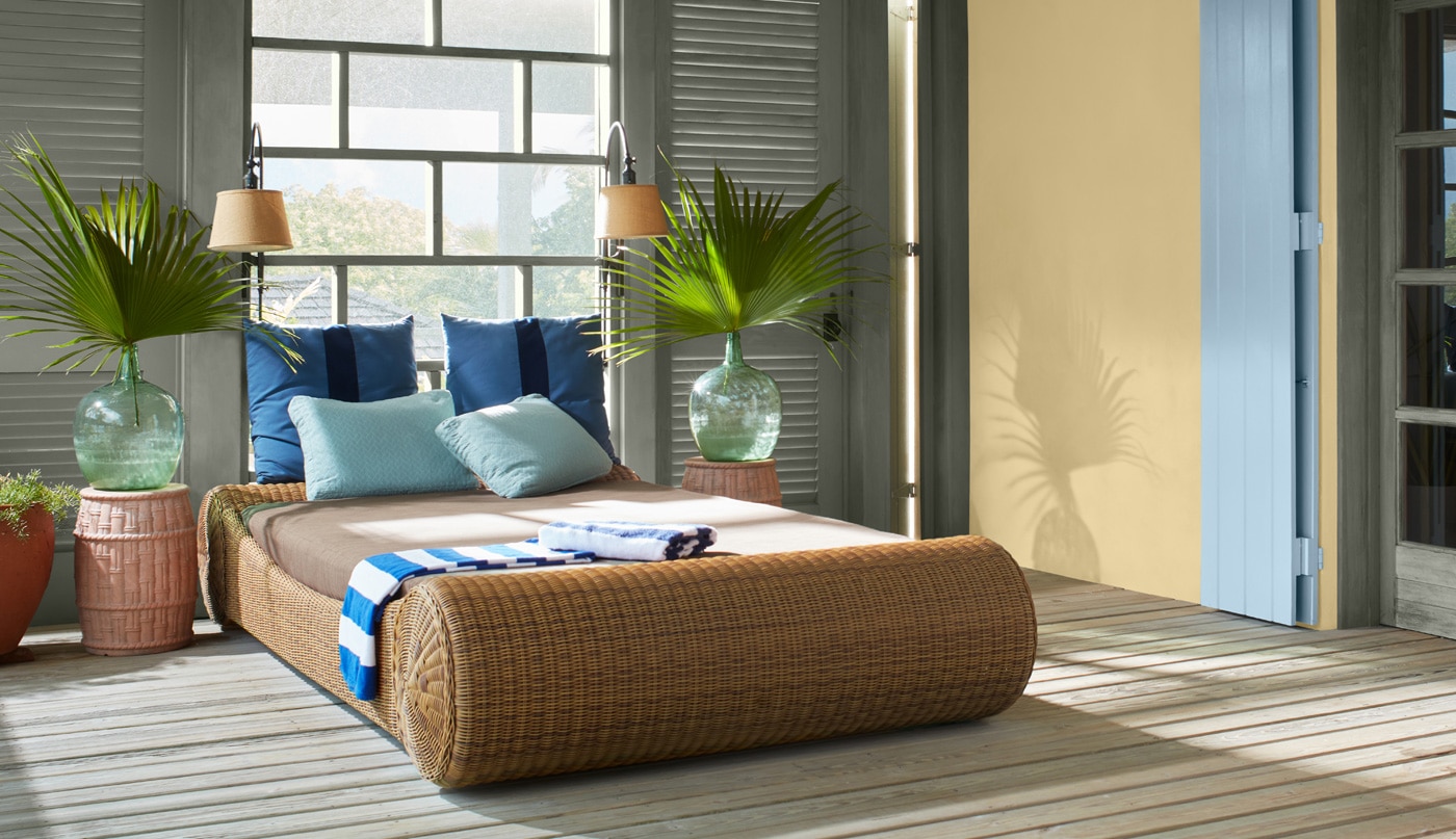
Make Any Room a Sunroom
Bring sunny warmth in with pale and mid-tone yellow hues that enhance your room’s light. Our favourites include:- Pale Moon OC-108, a classic soft yellow
- Beacon Hill Damask HC-2, a sunny yellow from our popular Historical Collection
- Chestertown Buff HC-9, an earthy honey
Use sheen/finish to highlight your golden hues. Choose an eggshell sheen or higher (think pearl/satin, semi-gloss or high-gloss) so that natural light organically bounces around your space. If you prefer a less reflective effect, a flat matte finish might be best for you.

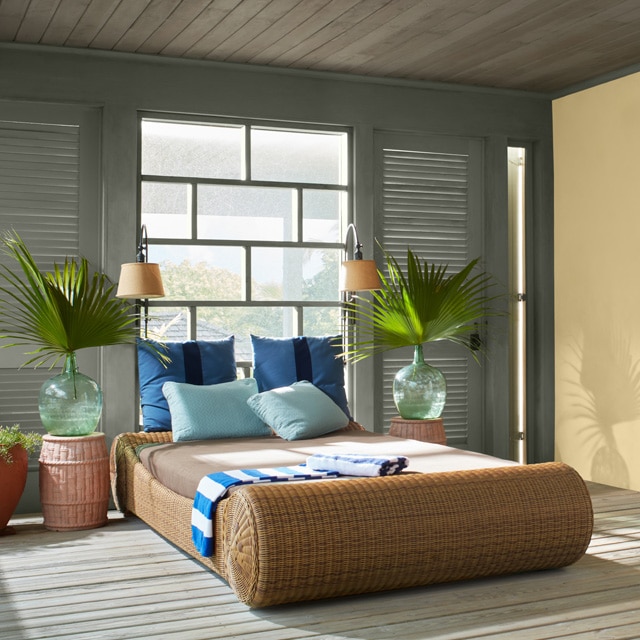
Highlight Outdoor Views with Colourful Window Trim
A well-placed window is a dynamic piece of art, showcasing seasonal changes in outdoor colour and texture every day.To accentuate a beautiful window view, consider:
- Painting window trim in a darker shade than your wall. Here, rich and sumptuous Hale Navy HC-154-painted mullion emanates out to light Smoke 2122-40 outer window trim. Against white walls, the result is a colourful lens through which to view the natural world.
- Painting trim in a lighter paint colour against deeper-hued walls is another winning approach. Bright, crisp white-painted trim pops against deep hues, drawing the eye outward.

White Paint Colours as a Base for Natural Décor
White painted walls enhance spaces while providing the perfect canvas for natural décor. Err on the warmer side of white hues such as Mannequin Cream OC-92, Timid White OC-39 or Simply White OC-117, a former Benjamin Moore Colour of the Year.Rattan, wicker, cane, sisal and sea grass bring tactility, warmth, and nature’s vitality to any space, especially when enveloped by white hues to create a cocoon-like vibe.

Watery Hues Elevate Earth Tone Colours
Water, another of nature’s classical elements, beautifully balances warm, natural colours and delivers cool, refreshing vibes.Colours and materials that echo surf and sand create calming spaces that welcome and comfort. Consider these classic blue-meets-beach colour pairings:
- Mineral Springs CC-848 on walls with Acadia White OC-38 on trim
- Tranquil Blue 2051-50 on walls with White Sand OC-10 on trim
- Paradiso 717 on walls with Fossil AF-65 on trim

Ground Your Space with Dark, Earthy Hues
Darker-hued walls—think dark browns, grays and black hues—allow natural elements like plants and fresh flowers to pop.If all-dark walls are too much for you, try deep, earthy tones on accent walls or on the lower portion of a room, with wainscotting or “feign-scoting.”
Here, lower cabinetry in a deep brown-green works to give this boho kitchen space an earthy, homey energy. Favourite deep hues we love include:

Integrate Indoor and Outdoor Spaces Using Paint Colour
Natural materials and finishes blend interiors seamlessly with the outdoors. Here, Guilford Green, a former Colour of the Year from our colour palette above, is a perfect gentle green thanks to warm undertones that align effortlessly with the natural wood in this contemporary bathroom.Green hues deliver soothing, natural vibes. Consider the following greens for a nature-kissed bathroom:
- Van Alen Green HC-120, a refreshing pastel
- Italian Ice Green 2035-70, a light green with blue undertones
- Soft Fern 2144-40, a favourite muted green for bathrooms

Colour Samples
Buy one or more colour samples to help finalize your choice of colour—and ensure peace of mind.
