Using a Monochromatic Palette in Interior Design
Paloma Contreras Shares Her InsightsRead What Paloma Contreras Has to Say:
Interior designer Paloma Contreras, of Paloma & Co., shares her approach to working with monochromatic palettes from her store, located right next door to her design studio in Houston, Texas.
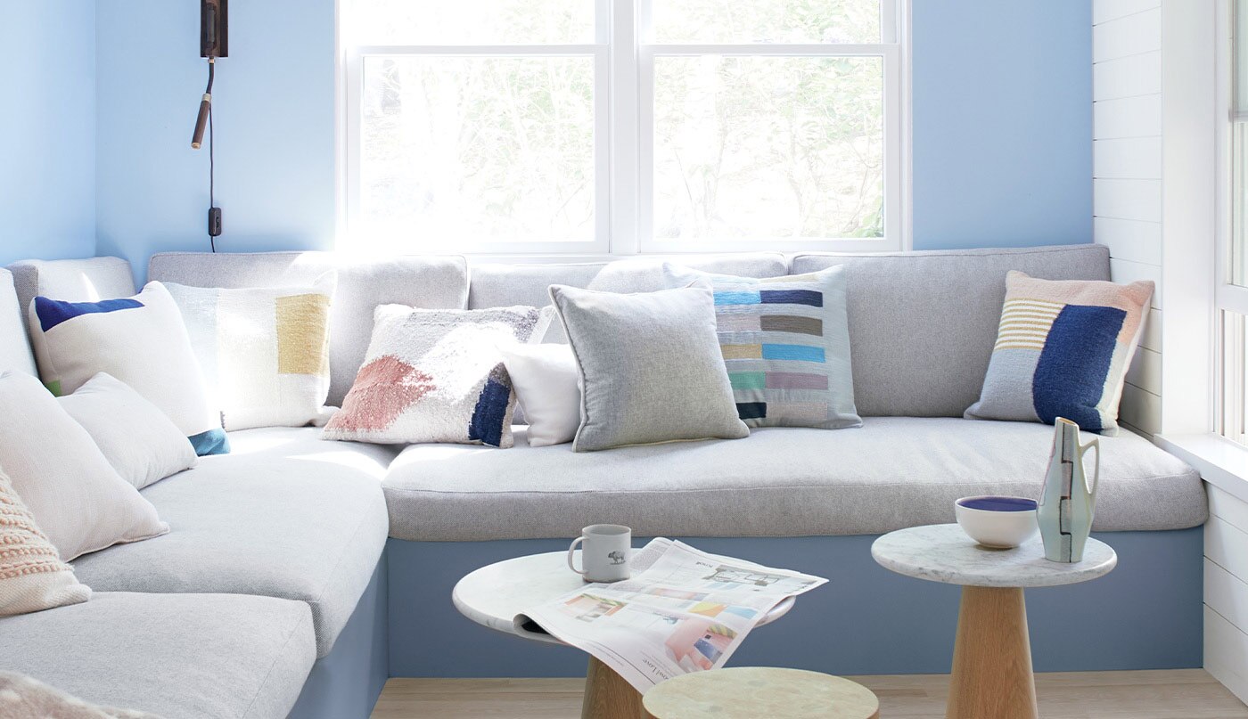
Contreras believes that when using color, it’s important to be intentional. “And it feels more intentional when it's more focused rather than being a chaotic symphony, a ruckus symphony of color. So when I start with a monochromatic palette, I like to either layer in various hues of a single color or potentially layer in interest with various textures and other elements that add a personality to the room.”
According to Contreras when she refers to a monochromatic palette, it doesn't mean that you use one color and one color alone, necessarily. “It can be a variety of hues of one color, such as varying shades of blue or green. It can also be complementary colors like blues and greens together within a neutral foundation. Or you could have a room that's entirely neutral, but add interest through various textures, such as plaster or natural fiber and different specialty finishes to really take it to the next level and make it feel less one note.
“A beautifully designed room can feel both modern and classic due to the use of mindfully selected materials. If you're picking elements that may seem disparate, they can come together, especially in a monochromatic interior to create tension and interest, which are really necessary elements in the sense that when you have a quieter palette and you don't have a ton of pattern or different colors, you have to layer in interest through some of these other elements in order to make the space really have some personality and come alive.”
When working with a monochromatic palette, the key is to determine the palette early on and then layer in interest using specialized design details. Mixing antiques with modern pieces, bringing in a special wall treatment, such as plaster or lacquer, and then adding other elements to create tension, such as abstract art or a really great sculpture. Use items that mean something to you and your space to really make it come alive and have more personality.
Bringing Color to a Monochromatic Palette
“As you're working on your monochromatic palette, you may wonder if it's okay to bring in a color that's completely different. And the answer is yes, because you want to create a little bit of what I call visual tension, and the way that I define that essentially is creating enough visual tension, not discomfort, but just layering in something unexpected really brings a room to life.
“I was just presenting a design to a client that we have in Palm Beach, and we designed this beautiful master bedroom for her and all of these gorgeous hues of coral and soft pink. But we brought in this gorgeous mid-century Italian chest that's ebonized, so it's black. And instead of being jarring, it serves to ground the space and give it a little bit of visual weight so that everything doesn't feel one note or too light in this case, in a sense that we're using pastels, it really gives it a little sense of gravitas.”
Think about the foundational elements of a space. Think of the rugs, draperies, the things that really set the stage, those elements that bring in that additional bit of contrast serve a similar purpose. They keep the room grounded in the sense that it keeps it from going over the top. “And if that means that you have a space that's overtly feminine, it could be something to give it a little bit of a masculine energy to counter that. Or a room that's extremely formal, it has a lot of formal elements, maybe a custom crafter wallpaper, lots of skirted furniture and classic silhouetted furniture. When you bring in that modern piece of art, it just gives that little extra zing to keep things from feeling thematic, and instead it becomes more eclectic and has a lot more personality.
“I don't necessarily work in a single monochromatic palette, and I do love color. In fact, I use color to great effect in most of my projects, very rarely have I ever done a project that was entirely neutral. And, we use a lot of color in each space, but it's always used in a way that feels really mindful. While I love interiors by other designers and the great designers of the past that have a ton of pattern and, just color upon color, and textile upon textile, for me personally, it feels like a lot of noise.
“Even though I can admire it and respect it as a fellow designer and design enthusiast, I have to take my own tastes into consideration. And I always say to thine own self, be true. And if you truly love something, then it's always going to work, you'll find a way to make it work. We've used every color that I can think of, any color really from under the rainbow to great effect with a monochromatic palette. And that's because as a general rule of thumb, the way that I design typically starts with a more neutral palette.”
Contreras generally saves the color and accents for more minor pieces, depending on the client. “While we've done draperies in beautiful colors more often than not, if I were to break down my design approach into a formula, we would have the foundational elements be more neutral. And that would be our upholstery, our drapery, our rugs, things like that. And then we build upon that adding interest in color, through pillows, art, other textiles, and the various accents in the room. And so in the end you have something that feels layered and beautiful and interesting, but the sense of color isn't overwhelming. And in order for it to be pretty, in my opinion, it has to be a controlled approach to color.”
According to Contreras, you truly can use any color in a monochromatic palette and make it work as long as it's a color that you love. You can use that as the foundation for your space, but just know that it has to be used in a mindful way.
“Typically the way that we decide on the color palette for a house is in conjunction with a client in the sense that we've done a lot of homework and legwork upfront getting to know them, their likes and dislikes, which colors they love, which colors make them feel good, which colors they feel are flattering to them,” notes Contreras. “And then we build from there. And so, a great tidbit, if you're stuck deciding on a color for any one of the spaces in your home is to think about the colors in your wardrobe. What colors do you love to wear? If you look fabulous in your favorite blue shirt, it looks great on your skin tone, and you always feel good in it. Chances are, you're going to look great in a blue room or a pink room for that matter. So, that's always a great place to start, but essentially, we listened to the clients and their preferences, and then we go from there.
“If I know that they love blues and greens and a little bit of pink, or, chartreuse, then I take that and run with it and figure out the best spaces for each of those colors. And I also make sure that at least one of those colors becomes a cohesive thread throughout the house, so that we aren't going from room to room, having each space feel really disjointed or completely different from the next, there's always got to be a cohesive common thread that carries you throughout the entire home, so that it all feels like, even though each room tells its own story, it's all part of the same book.”
At the end of the day, a home reflects those who live there. “Ultimately, how I like to live and how the next person likes to live or feel in their home is wholly personal. And so you may find that living in a completely neutral environment works for you, and it sets your mind at ease. And maybe that helps you to escape the chaos from the outside world. In terms of trends, we will start to steer more towards color in general, because people want to feel happy again. They want to feel a sense of jubilation. And I think we'll feel like collectively we're celebrating something when this is all behind us, but there will be those who just prefer to live in a neutral environment. And that's perfectly fine, too.”

Guide to Monochromatic Color Schemes
See how monochromatic color schemes can create an elevated design in any home.


Inside Design
Explore distinct design topics from the interior designers featured on this page.